Holiday Wishes

Sending my blessings and love-filled wishes for all of you this holiday season. I hope your days are filled with whatever they need to be filled with. Joy, quiet, sadness, reflection, excitement - whatever you need to feel. But most of all, I hope your days are filled with love. Love for yourselves, love for others and love for what is. ❤︎

(Oh, and Shiny Brites!! Cuz those are the best!)

Why It's Time to Retire This Whole Color of the Year Thing

IMG_5984.JPG

It's that time of year again. No, I'm not referring to the season when cheesy holiday tunes start prematurely blasting through TJ Maxx (although I did experience that just a couple of days ago.) I am referring to that time of year when the ubiquitous Color of The Year is announced. Again and again. And again. 

This is not a conversation I generally participate in, ironic as that may be. The Color of The Year happens and I nod or shake my head, depending on the particular chosen hues, but continue going about my business. Because, honestly, it doesn't really matter. 

Yep. I said it. It doesn't matter. Not to me, not to you. Unless you are a color forecaster whose job it is to select these hues or are part of the marketing team of a major paint company. Then it matters. It gives you something to hang your hat on. And it has the potential to make lots of money. Let's face it - the Color of The Year is a big marketing gimmick. 

And why is that a problem?

It's not really. It just doesn't have much of a point. And it doesn't really help anyone with anything. I struggle to find a purpose to it all.

I'm not saying the Color of The Year is a bad idea. I think it's actually rather ingenious. It creates a lot PR buzz that lasts year-long...and then can start up all over again the next year. And the year after that....and the year after that...and the year after that. It can really go on forever because there are an infinite amount of colors that can be featured. (I think this is true. I might need a color scientist to step in here and correct me if I'm wrong.) But infinite, as far as you and I are concerned, especially if we're introducing just one color a year. This could pretty much go on forever.

So why does it need to be retired? A little strategic marketing never hurt anyone, right?

It's not that it hurts anyone. In fact, the crowning of a particular hue as the Color Of The Year can be validating. This year, with two whites (yes, I'm calling them whites because that's what they are), is EXTREMELY validating for gazillions of us. White has been making the decorating world go round for at least the past five years and arguably since the dawn of man. Or at least the dawn of paint.

And it may make some people very happy. "Yay! White! I love white. Now it's The Color of The Year! That makes me happy." And I'm happy for you. And I was happy when "your" color was chosen last year. And the year before that...and the year before that. And I was right there with you that year it wasn't your color, and you were very upset. I was upset, too. Then I had to ask myself why. I was upset because I didn't like it. And because I didn't think I would be able to use it. I was upset because I felt left out of the color party. Because the Color of The Year can be very ostracizing if you happen to be one of those people that just doesn't "get it." (You've been there, right? Hello, Marsala! For me, anyway. )

Before I am deemed a color forecast hater, I should clarify that I think color forecasting has a very useful place in this world. Color forecasters track the pulse of color trends over time and it's important information from a historical, cultural and sociological perspective. So I'm totally on board with general color forecasting. 

But the Color of The Year? Again, I struggle to find a purpose. Because what are we supposed to do with it? If a paint company calls out a single color as their favored hue for the entire year, what are they saying about all the other colors in their paint deck? And what if we just don't like this year's Color of The Year? Do we have to wait an entire year to see if we'll like the next Color of The Year before we paint our homes or buy a new sofa? Does this mean we'll be seeing more white, for example, in 2016? I'm not sure how that would even be possible. 

So maybe we can just do away with this whole Color of The Year thing and celebrate all colors, every year. Or at least you can celebrate the colors you love. Because when it comes down to it, it just doesn't matter. Let's have a color party every day that everyone's invited to. And Simply White, you can totally come, too. You can even bring your friend Alabaster.


When to Paint Your Kitchen Cabinets

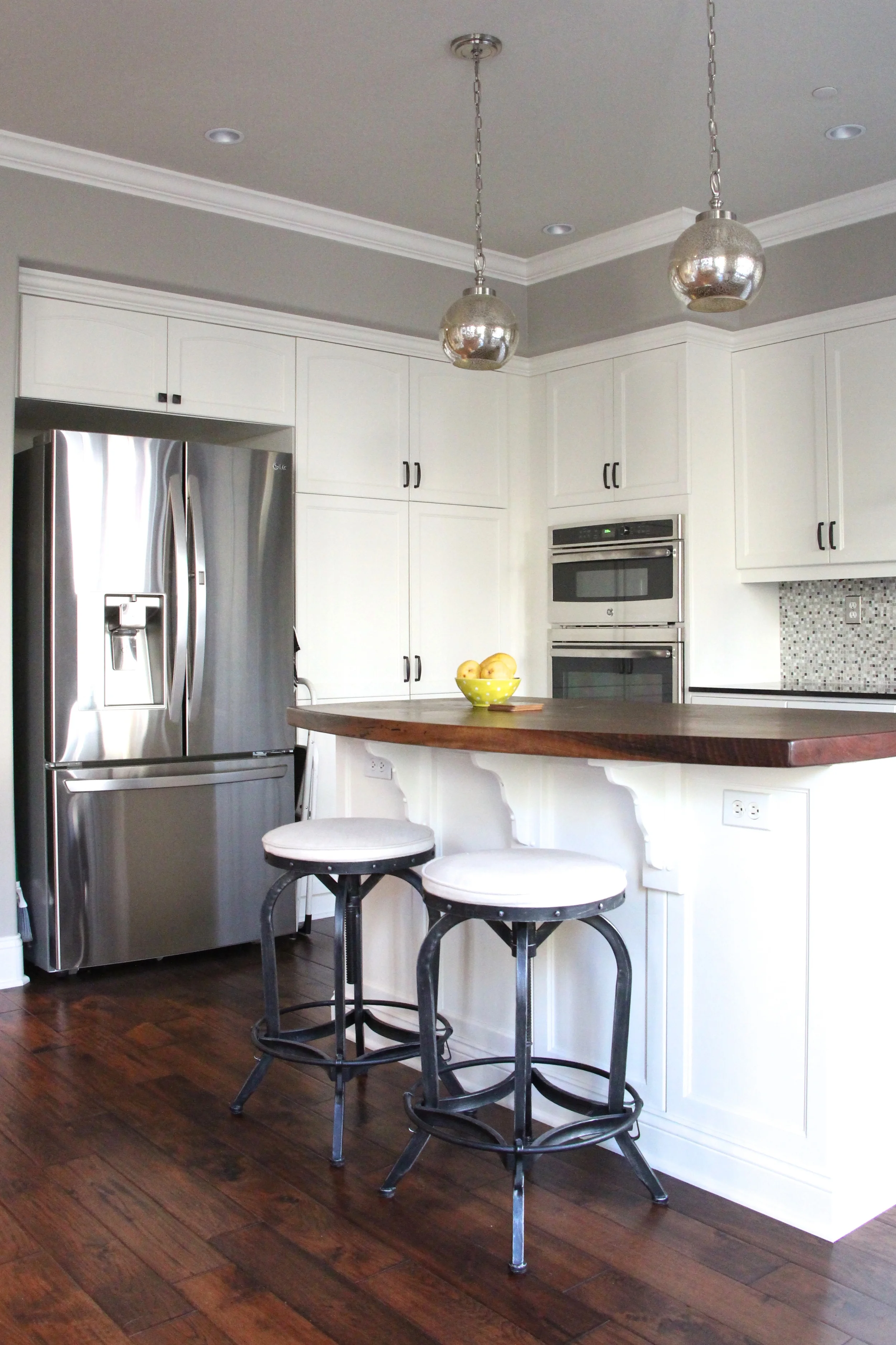
Here's my latest kitchen remodel project. Isn't she pretty?

And the before. Quite a transformation, huh? 

My client contacted me about a year ago. She was getting ready to undertake her kitchen remodel, but needed guidance on materials, colors and overall design. Her first question to me was "Do I replace my cabinets? Or paint them?" 

I answered her question with a couple more questions. Did the kitchen function well for her? Did it have enough storage and was it easy for her to get around? Yes. It had plenty of storage and she was happy with the overall layout. 

Then I asked her what problem she was trying to solve? And would replacing her cabinetry solve that problem?

This was a bit of an "aha" moment for her. And it is for most of us. Before we proceed with any design project it is important to identity the problem we are trying to solve. If we don't know what the problem is, then we don't know what to fix...or how to fix it. 

We identified the problem as an aesthetic one. She just didn't like the way her kitchen looked...or felt. I suggested she save herself thousands of dollars and paint the cabinets as opposed to replacing them. They were in excellent condition, and although the door style wasn't exactly what she would have chosen if she was buying new, they weren't bad at all. And with a coat of paint and new hardware, they would take on an entirely different character. Replacing the cabinetry would have solved the problem in some regards. It would have given her a new look and feel, but it wasn't necessary for her to fix the problem. Painting the cabinetry was a much simpler and less costly solution. 

My client knew she wanted white cabinetry. She had already pulled some inspiration images of kitchens she liked when we first met. Over the next couple of months I helped guide her on countertop materials, hardware and fixture finishes and style, lighting, paint color and custom tile design. We collaborated through the process with my client playing the role of project manager - my favorite way to work! 

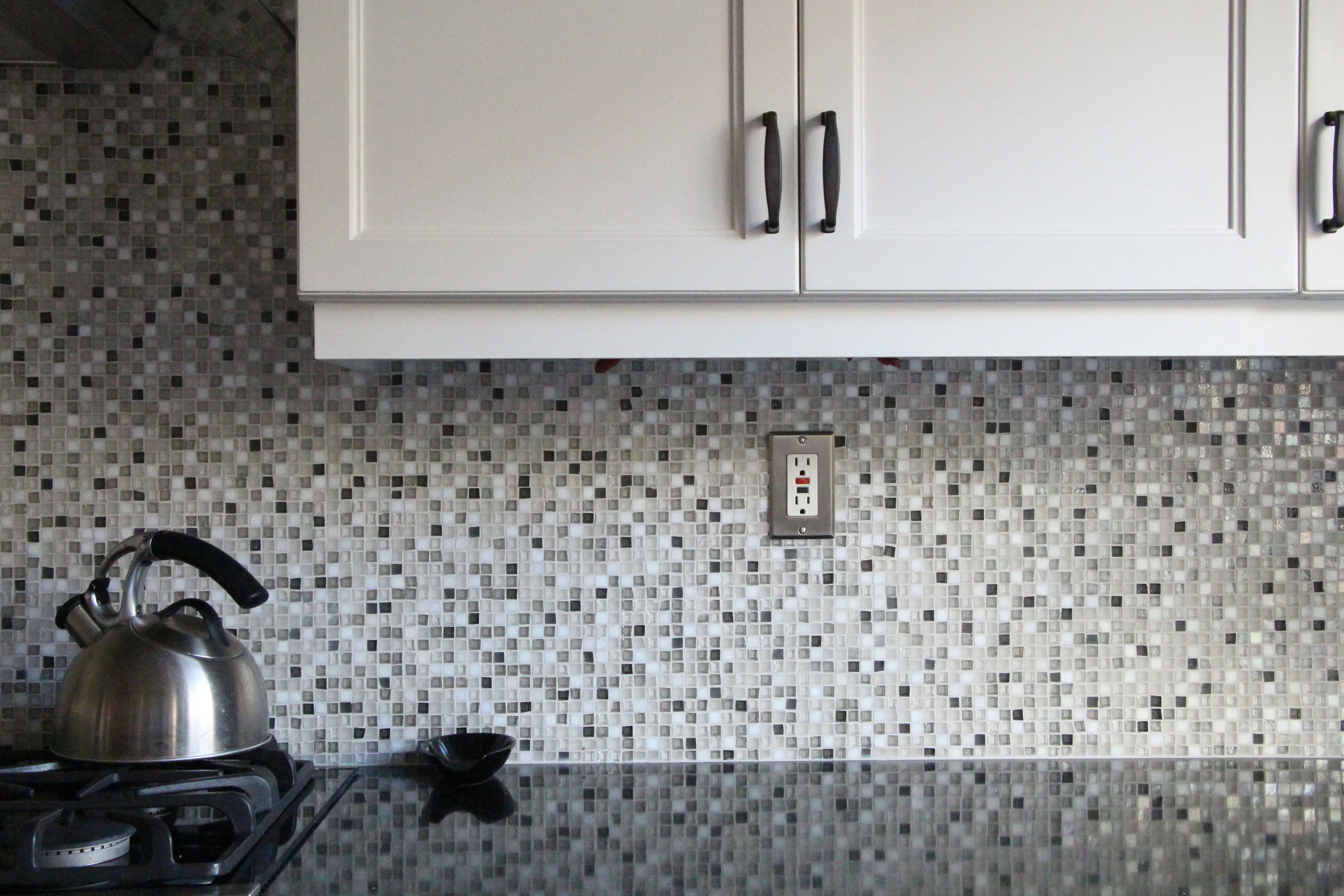
For those of you drooling over the gorgeous backsplash, the tile is from Oceanside Glass Tile. We did a custom blend in Facets 1/2" x 1/2" mosaic. They have a super cool online tool to play with proportions of colors, so you can get very specific about your blend. 

And...for those of you drooling over the wood island countertop, it is a beautiful piece of reclaimed walnut from Heritage Salvage in Petaluma. I love the warmth and patina that it brings into the space. 

The end result is a stunning space that truly reflects the energy of my client. I'd take this kitchen, wouldn't you?


What is a "Soothing" Space? And How Do You Get one?

Ah. The elusive "soothing" space. We all talk about it. Usually when referencing the ideal bedroom, but sometimes another space in the house. And it is usually characterized by the color blue...maybe green...or, most likely, "neutrals." Or even white. We like our soothing spaces to be clean, uncluttered, not fussy. We don't want bold colors and we don't want it "too dark". We want to feel calm and relaxed in the space, hence the descriptor "soothing". 

Sometimes, however, in an effort to create soothing we end up with boring. We often have the tendency to strip everything out of a space that makes it interesting in an effort to make it calm. We become so entrapped by the idea that a soothing space needs to be completely unstimulating that we can easily end up with a room that causes a sense of unease...because it's not stimulating enough. How's that for ironic design? As humans we need a certain level of stimulation in our environments. We thrive off it. Some of us can handle more stimulation that others - we don't all want a home designed to Liberace standards -  but most of us would benefit by more stimulation than what we think we need when we are aiming to create a soothing space. 

So what does this all mean? Is it really possible to create a space that is both stimulating and soothing at the same time? Yes, it is. And not only is it possible, it's necessary to create a space you love. But how, exactly, do you find the balance? How do you know what works for you?

The answer is not quick and it's not easy. It takes a little work and a little trial and error. The design journey involved in creating a space that is soothing to you may at times even feel overwhelming. How do you know where to start? And how do you know when enough is enough? Or when it's not enough at all?

I'm not going to give you the all the "right" answers here.  I could tell you that you always need three decorative pillows on your bed, and that you should always have an area rug under your bed that covers approximately 2/3 of the floor. But that would be arbitrary design advice and I don't think that helps you at all.

What I do think helps is asking the right questions. So let's start there:

  • How do you define the word "soothing"?

  • Are there any other words you can use to define your ideal space?

  • What don't you want in your space and why?

  • Are there any fears coming up around decorating your space? Are you afraid it will be "too dark", "too trendy" or "too busy"?

  • What don't you like about your current space? What do you like?

  • Why is "soothing" so important to you? Are you trying to escape from anything in your life?

The last question is a big one. Maybe you aren't trying to escape anything. But maybe you are. There is a reason many of us are drawn to soothing spaces. We want a place to unwind from all the crazy. And sometimes crazy is inevitable. But sometimes our need for soothing can be indicative of what's going on in the rest of our lives. It can be a clue that something else needs to change. Just something the chew on...

Regarding the physical design of your "soothing" space, there are a few guidelines to follow:

  • Do not, under any circumstances, have anything in your space that you don't love. If you don't love it, it won't soothe you. I don't care if it was a gift or it used to belong to your grandmother. Get. It. Out.

  • Fix anything that's broken. Broken things are not soothing. They create stress because they are a reminder of just "one more thing" you have to do.

  • Bring in your favorite colors. Not the ones everyone else is using - the colors that you love. Don't worry about if they are "in" or not.

  • Keep it tidy. Not necessarily Konmari tidy, but put your stuff away and organize it. Have a place for everything.

  • Leave some of the good stuff out. Like a pile of favorite books on the coffee table. Or a coaster for your teacup. Things that make you feel good or allow you to use the space with ease.

  • Keep it clean. Duh.

  • Make room to do what makes you happy. If it's playing the guitar, make a space to sit or stand and play comfortably and room for your instrument and music. If it's reading, have a proper reading light and a comfy chair.

  • Have at least one thing in the space that makes you smile. Maybe it's a goofy figurine...of Goofy. Maybe a quirky piece of artwork. Something that doesn't take itself too seriously.

And last but not least...

  • Bring in your authentic self. When you are in the space, you will feel most soothed if it truly lives and breathes your essence. In fact, isn't this is the very definition of a soothing space? A space that is so "you" that you are one with it? And you, my friend, are a very interesting being. For you to be one with your space means that your space needs to be interesting, too.

So, go ahead. Get to work on your soothing space. You might very well end up painting it blue. And that's ok. As long as blue is a color you love. 

How to Create an Inviting and Functional Entryway

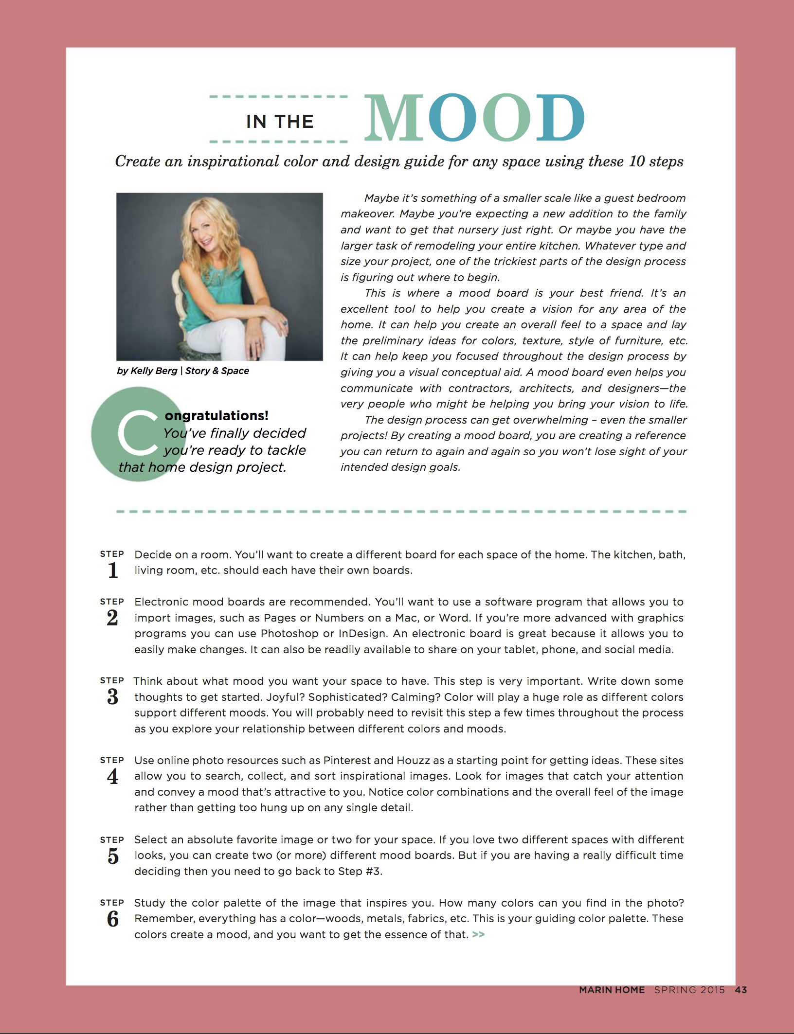
Helloooo! It's been way too long again, hasn't it? I've missed you! Let's get this Tuesday going with a few tips on how to turn your entryway into a space that really works for you. Marin Home Magazine's Fall 2015 issue just came out and I've got an article for you on this very topic. You can head on over to the digital edition for the full read. Here's a little teaser:

"Is your home’s entryway a welcoming space? Does it greet your arrival with a smile and give you a warm, fuzzy hug you as you leave? Although it often gets overlooked in the design process, the energy of this space is not to be taken lightly. Let’s take a look at five key components to see how your entry is - or isn’t - meeting your emotional and functional needs. Once you’ve identified the problem areas you can make changes so that your entry works better for you."

How IS that entry working for you? There's no better time than now to re-vamp a space that's most likely going to get a lot of use during the holiday season and the colder, hibernation-y weather.

By the way....notice anything different around here? I had been wanting to update my website for awhile now and...here it is! It's more of a refresh than a complete overhaul. But sometimes that's all we need, right? Squarespace was my saviour. Seriously - a great tool, a great interface, great integration of social media, great tech support. Great, great, great. And now I have my blog on the actual Story & Space website as opposed to blogger, which had been bugging me for a long time. Welcome to 2015! (Never mind that it's almost 2016...)

Thanks for swinging by! And be sure to sign up with your email address over on the swanky new sidebar (right over there on your right) so you don't miss anything really important. 2015 (and 2014 for that matter) kinda knocked me out. But I've got high hopes, plans and energy for the 2016. And I just might send you something cool.