Step inside the most magical redesign of this Tudor home basement!
Read moreExterior Color Design: Color is Personality
There’s a huge amount of fear that creeps in with color selection for many clients and projects, but exterior color brings a whole collection of emotional challenges. “What will my neighbors think?”
Read moreIt's Times Like These
It’s times like these when we are reminded that the meaning of home is so much more than a perfectly placed pillow or a shiny marble countertop. It’s times like these when I find myself feeling grateful for having a soft bed to sleep in. For having food in the fridge, and the sun streaming through the west windows, warming my face and feet. For having a car conveniently parked in the driveway, running water, heat and doors that lock. For being able to wash my clothes and take a hot shower. For being able to walk outside for a breath of fresh air, and listen to the birds chirping in the plum trees.
It’s easy to get caught up with the not-so-perfect. The things that need to be fixed, redesigned, cleaned, and organized. But home is a gift, even when it’s undone. Interior design is truly a luxury and a privilege. That doesn’t mean it’s not important. It absolutely is, and I adore helping my clients transform their spaces. I wish for all of us to live in impeccably, authentically designed homes. What a dream! But even more, I wish for all of us to have a safe place to rest our heads, bodies and souls each night. And that every single home on this planet, however done or undone, is filled with peace, not war.
Napa Craftsman Gets a Beautiful Color Makeover
I worked on this home's exterior color design last year and finally just got around to taking some pictures. Isn't she gorgeous? All the paint was C2 full spectrum. Such a fun project with a wonderful client. I'll let the photos do the rest of the talking.
Before
After
Why It's Time to Retire This Whole Color of the Year Thing
It's that time of year again. No, I'm not referring to the season when cheesy holiday tunes start prematurely blasting through TJ Maxx (although I did experience that just a couple of days ago.) I am referring to that time of year when the ubiquitous Color of The Year is announced. Again and again. And again.
This is not a conversation I generally participate in, ironic as that may be. The Color of The Year happens and I nod or shake my head, depending on the particular chosen hues, but continue going about my business. Because, honestly, it doesn't really matter.
Yep. I said it. It doesn't matter. Not to me, not to you. Unless you are a color forecaster whose job it is to select these hues or are part of the marketing team of a major paint company. Then it matters. It gives you something to hang your hat on. And it has the potential to make lots of money. Let's face it - the Color of The Year is a big marketing gimmick.
And why is that a problem?
It's not really. It just doesn't have much of a point. And it doesn't really help anyone with anything. I struggle to find a purpose to it all.
I'm not saying the Color of The Year is a bad idea. I think it's actually rather ingenious. It creates a lot PR buzz that lasts year-long...and then can start up all over again the next year. And the year after that....and the year after that...and the year after that. It can really go on forever because there are an infinite amount of colors that can be featured. (I think this is true. I might need a color scientist to step in here and correct me if I'm wrong.) But infinite, as far as you and I are concerned, especially if we're introducing just one color a year. This could pretty much go on forever.
So why does it need to be retired? A little strategic marketing never hurt anyone, right?
It's not that it hurts anyone. In fact, the crowning of a particular hue as the Color Of The Year can be validating. This year, with two whites (yes, I'm calling them whites because that's what they are), is EXTREMELY validating for gazillions of us. White has been making the decorating world go round for at least the past five years and arguably since the dawn of man. Or at least the dawn of paint.
And it may make some people very happy. "Yay! White! I love white. Now it's The Color of The Year! That makes me happy." And I'm happy for you. And I was happy when "your" color was chosen last year. And the year before that...and the year before that. And I was right there with you that year it wasn't your color, and you were very upset. I was upset, too. Then I had to ask myself why. I was upset because I didn't like it. And because I didn't think I would be able to use it. I was upset because I felt left out of the color party. Because the Color of The Year can be very ostracizing if you happen to be one of those people that just doesn't "get it." (You've been there, right? Hello, Marsala! For me, anyway. )
Before I am deemed a color forecast hater, I should clarify that I think color forecasting has a very useful place in this world. Color forecasters track the pulse of color trends over time and it's important information from a historical, cultural and sociological perspective. So I'm totally on board with general color forecasting.
But the Color of The Year? Again, I struggle to find a purpose. Because what are we supposed to do with it? If a paint company calls out a single color as their favored hue for the entire year, what are they saying about all the other colors in their paint deck? And what if we just don't like this year's Color of The Year? Do we have to wait an entire year to see if we'll like the next Color of The Year before we paint our homes or buy a new sofa? Does this mean we'll be seeing more white, for example, in 2016? I'm not sure how that would even be possible.
So maybe we can just do away with this whole Color of The Year thing and celebrate all colors, every year. Or at least you can celebrate the colors you love. Because when it comes down to it, it just doesn't matter. Let's have a color party every day that everyone's invited to. And Simply White, you can totally come, too. You can even bring your friend Alabaster.
How to Create a Mood Board
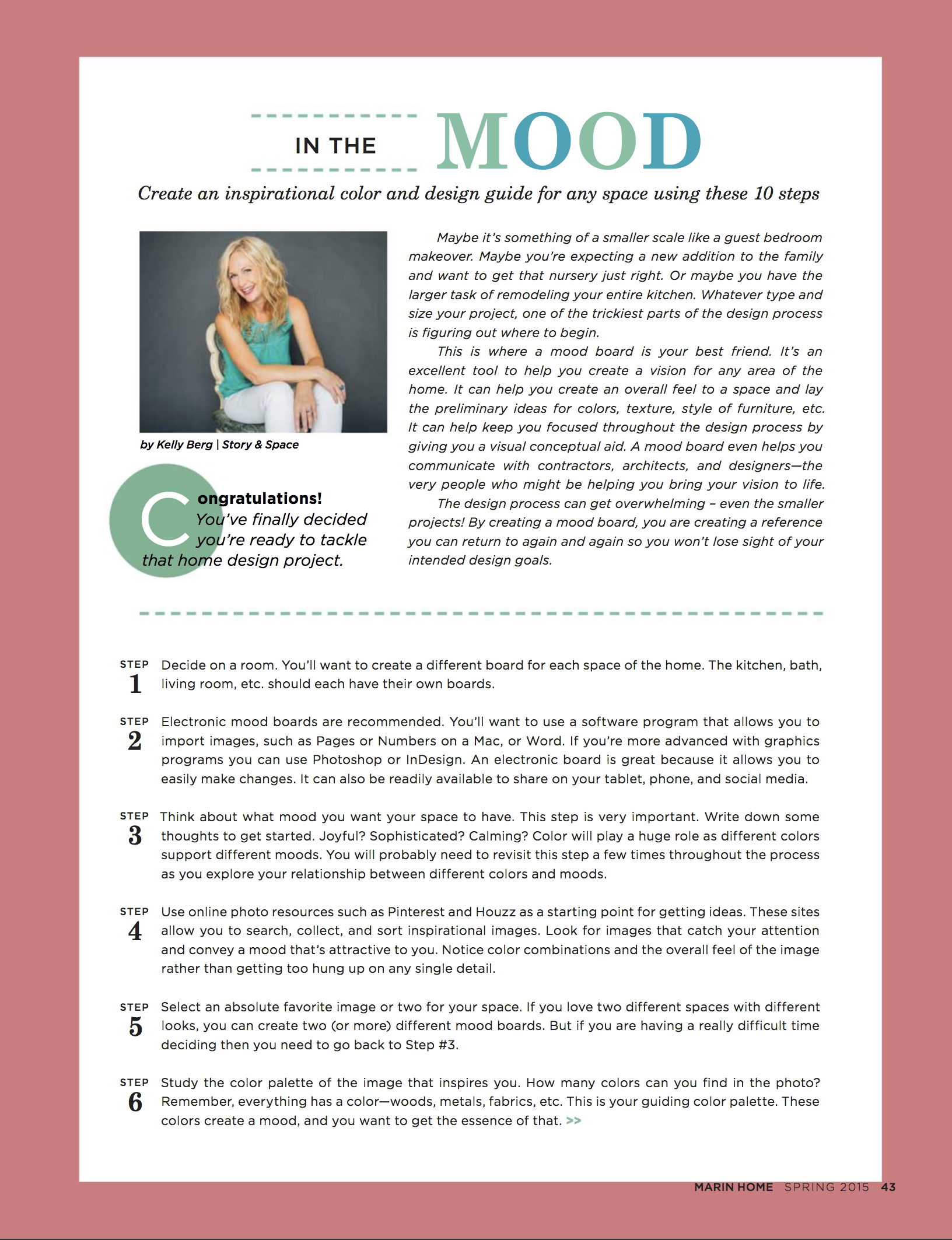
“The design process can get overwhelming - even the smaller projects. By creating a mood board, you are creating a reference you can return to again and again so you won’t lose sight of your intended design goals.”
Hey, everyone. Just wanted to let you know that the latest issue of Marin Home Magazine is out. My article, "In the Mood", has some great tips on how to create an inspirational mood board. Hope you'll pop on over and read the FREE digital edition on issuu! Lots of great stuff in there, including an article on Frank Lloyd Wright's Civic Center design. (I can see the gold spire from my backyard - cool, huh?)
I know I haven't posted for awhile, but I'm still here. :) For those of you who have wondered whether or not I'm still taking on clients - yes, I am! Please don't hesitate to reach out to me. I'd love to talk to you about your upcoming color and design projects.


