Color Design Project in Burlingame: Before and After


Hello, everyone!

I've got some cool before and afters to share today of a project I worked on in Burlingame, CA. I was hired by my client to develop a color design plan for the social areas of the home. This house was gorgeous when I arrived - before we added wall color. And now it's even more gorgeous. It's such a blast to work on projects like this...and just as fun to share the results.

Dining Room Before
Dining Room After
French Doors Before
French Doors After
Working on the color palette...
Dining Room Before
Dining Room After
Dining/Hallway Before
Dining/ Hallway After
French Doors/Dining Before
French Doors/Dining After
Living Room Before
Living Room After
Dining/French Doors After
Dining Room After
Entry After
Fireplace After
Hallway After
Kitchen Before
Kitchen After
Kitchen After
Now, I can't go into too many details about this project at this point, as it was recently scouted by a shelter magazine. Crossing our fingers that it makes the cut! 

Looking to add more color to your already beautiful home? Give me a call at 650.867.3896 or send me an email at kelly@artestyling.com to discuss your project.

Marin Color Consultant Quoted in Better Homes & Gardens

BHG

Forgive me for the cheesy blog title. I am trying to get things activated in the SEO department. Since moving to Marin last summer, I've noticed that my business is slow to come up in Google searches in this area. So, a girl's gotta do what a girl's gotta do! Promise - there won't be many. I like to eat cheese, not write it.

Which brings me, albeit awkwardly, to the point of this post. Better Homes and Gardens just recently included me in an online article "Decorating with Color: Expert Tips." There's some great quotes from a few very well-known designers, along with some gorgeous visual inspiration. I'm honored to be part of the story! Thanks, BHG.

House Beautiful Isn't the Only One "All About Green"

House Beautiful March 2012 Cover

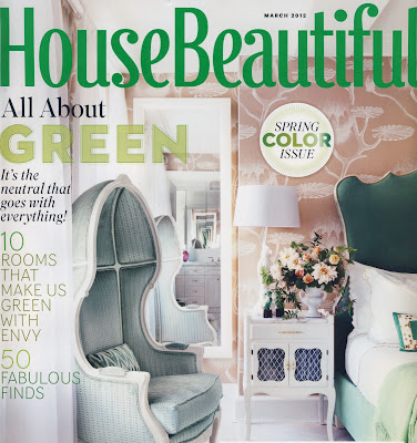
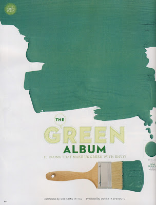
Has anyone picked up the latest issue of House Beautiful? It's the "Spring Color Issue" and it's "All About Green." I got mine a couple of days ago and I have to say, I was pretty surprised. In a good way.


See, I've been decorating our place like a mad woman for the past couple of months. And painting. And I've been using lots of green.

As a designer, it's always nice to see the colors I am gravitating towards at any particular time be highlighted in a big name shelter magazine. It's kind of a validation. Of what, precisely, I'm not sure. But something about it feels kinda cool. 

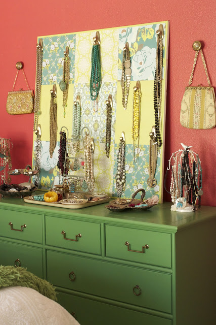
Check out this green dresser in a room designed by Meg Braff.


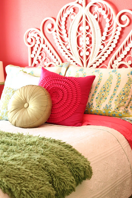
I also have a green dresser - which I love. Granted, my walls are currently a deeply saturated shade of pink, so the overall feel is a bit different. But it's a similar idea. The dresser is painted in Benjamin Moore's Bunker Hill Green.
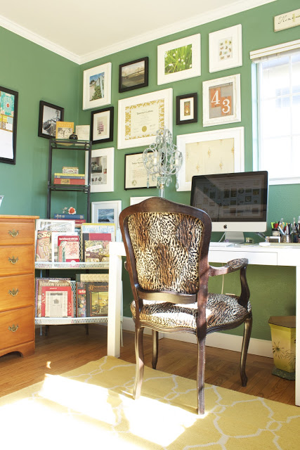
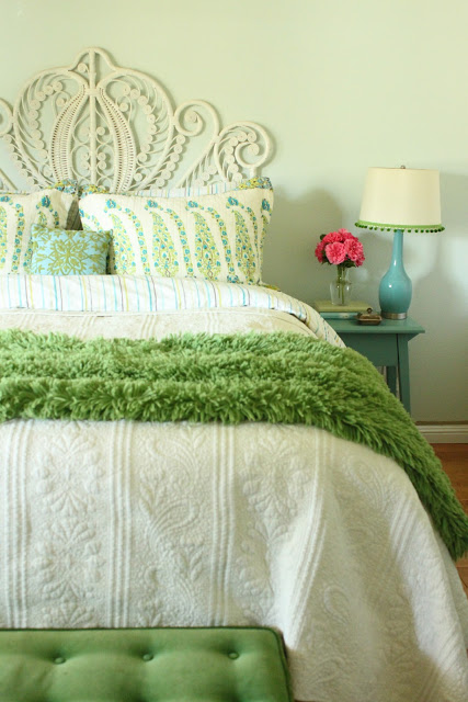

And here's my new home office. The walls are in New Glarus by Pratt and Lambert. I was searching for the perfect shade of "jade" green, and I think I found it.


But this one's the real kicker. Here are two separate rooms featured in the March issue. The first room, designed by Stephen Sills, is painted in Donald Kaufman's DKC 103. 


And the second room, designed by Amelia Handegan, is bathed in Benjamin Moore's Acorn Squash.


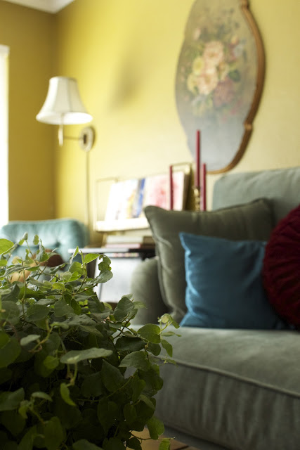
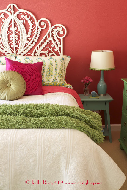
And here's my new living room, painted in Dragonwell by Benjamin Moore. 


I'm not trying to say "Look at me, I'm so awesome." I was just pretty flabbergasted to see such a similar wall color in House Beautiful. Dragonwell is not your typical green. It's a funky brown-ish, brassy, olive-y color. Definitely not for everyone. And it wasn't a color I found any images of before I painted. It was inspired by some vintage pillows and a wine bottle. I think it's so cool that I'm not the only one using this color. Perhaps that's the validation? That this funky color that seemed kind of risky is actually worthy of hitting the pages of a major shelter magazine. 

So thanks, House Beautiful, for sharing some great spaces in great shades of green. And for showing that using funky, unconventional hues is exactly what creates unique, inspirational spaces.

New Post on The Brave New Home Blog*Book


There's another new post up over at The Brave New Home: "Can Rented Spaces Feel Like Home?"  If you rent, you don't want to miss this one as it asks a very important question.

"When we don't own a space financially is it possible to own a space emotionally?"
- Chapter 8: What Are You Up Against? How to Be Brave in the Face of Domestic Adversity

I'd love to hear your feedback on this one, as I think it is something we seldom discuss.  Whether you currently rent, have rented in the past, or even if you are a landlord...let's get the conversation going.

See you over at The Brave New Home.

Bedroom Makeover - New Home, New Look (Old Stuff)


We moved into our new home about six months ago...and that's how long it's taken me to get this place in order. It probably would've taken longer, except I had a major incentive - a photo shoot at the house! My amazingly talented photographer friend,Vanessa Stump, was here a few days ago to take some shots of me for my new website (more on that later.) Let me tell you - there's nothing like scheduling a photo shoot in your own house to kick yourself into high-voltage decorating gear. I certainly didn't want to take pictures against piles of laundry and half-painted walls, so I spent the better half of January painting, shopping and styling. 


Here's a before. (See? Big mess. It's embarrassing to share this.)


And here's a couple of shots of the bedroom from the old house. (I blogged about this transformation here and here.)

Bedroom: Version 1
Bedroom: Version 2
Bedroom: Version 3
What's changed?

1) Wall color.

The new wall color is Benjamin Moore's Embroidered Flower from the Color Stories full spectrum line. I was originally thinking of painting the walls a blue-green, but we decided we already had enough cool blue-green hues in the house, and it was time for a change. It was a little bit of a challenge finding a color that would work with the existing headboard, bedding, nightstands, lamps and green dresser, but once I landed on this deep pink, I knew it would work. And I'm loving it. It's like sleeping inside a giant geranium.


2) Sheets

I found the awesome pink sheets AFTER the room was painted. I swear. Kate Spade sheets at Marshall's. On clearance. $25 for a queen set. Definitely a case of being at the right place and the right time.

3) Throw pillows

I added two throw pillows. Both the pink and green pillows are from Ross. I think they were $10 a piece.


4) Actual room

This room is not the same physical space as the first two shots. I know it looks the same but it's not. Sometimes when people move they feel like they have to change all their furniture and decor to "go with the house." I say, give paint a shot first. And invest in a few new accessories. Sometimes it's just a matter of tweaking a couple of things. I didn't love the way our bedding and furniture looked against the previously yellow walls. Now I do. Maybe even more than versions 1 and 2! 


5) Styling on nightstand

The lamp is the same, the other styling items are a little different. But, with the exception of the fresh flowers, I used items I already had. There's a million other ways I could have styled the nightstand. This is just the one I landed on for this particular shoot. 


Moral of the story?

Rooms can be transported from home to home. They may need a little customizing along the way. You might need to edit, you might need to re-style. But don't assume that just because you move you need to buy all new stuff. Sometimes the old stuff works just fine. 


If you've recently moved and are struggling with color and design decisions please call me at 650.867.3896 or shoot me an email at kelly@artestyling.com to discuss your project.