Napa Bath Remodel - Before and Afters


About 100 years ago, I started helping my parents with their master bath remodel. Well, maybe it wasn't exactly 100 years ago, but it certainly feels like it! It wasn't the layout that held us up, but the tile design. My mom had something particular in mind...and my dad had some other particular things in mind.


Here's a shot of the bath after my dad ripped out the old pink and green tile. (I would have loved to have had a before shot of that, but my dad was too speedy with the demo. You can just take my word for it that it was very dated...and a little all over the place design-wise.)

Bath vanity wall before
Yesterday I popped over to take a few shots of the remodel. There's still a few design details to tend to, but basically it's finished!

Bath Vanity Wall After
Bath Shower Before
Bath Shower After
My dad, handy, talented guy that he is, did the entire remodel himself with exception of the marble counter fabrication and the toilet installation. He even built the bathroom vanity. Lovely, right?


For the countertop, we used Michelangelo Carrara Marble. It's slightly different than the other Carrara Marble that is currently super popular for kitchens in that it has some gold flecks in it, and not quite as much gray. Marble can look very cold, but this marble doesn't. (Slab is from Da Vinci Marble in San Carlos.)

For the backsplash we used an off-white tile trim piece combined with a golden honey colored liner, both by Sonoma Tilemakers, one of my favorite go-to tile vendors. The mosaic by AKDO is also marble, very similar to the countertop with a golden undertone.


In the shower, we used 3x6 (subway) off-white field tile with the same golden honey liner and marble mosaic. We also added a 4 x 4 of the golden honey on a diagonal.


On the floor we used a 12 x12 of the same marble as the countertop and added a border in the marble mosaic. 

And on the walls we went with Ellen Kennon Full Spectrum Paint in Buttercream. It's absolutely yummy.

It took some patience and resilience (ok...a LOT of patience and resilience) to create a look that worked for both or my parents. But, the end result? They both love it. And for a designer, there's nothing better than that.

If you need help with your bath remodel please call me at 650.867.3896 or shoot me an email at kelly@artestyling.com to discuss your project. And, yes, I work well with couples.

New Post on The Brave New Home Blog*Book


Have you been to The Brave New Home yet?

If not, you might want to check it out.  I've got a new post up - "How To Add Character to Your Home." If you liked my recent post "How To Bring Joy Into Your Space", you should enjoy this one, as well.

"If your home were a person, is it someone you'd want to be around? Is it someone you'd want to be?"
- Chapter 10: The Brave New Home Workbook

I'm looking forward to seeing you on The Brave New Home. I'll be writing a lot more in 2012, so if you don't want to miss anything, you might want to subscribe to the posts.

And I'd love to know what you think! Since this is a book in-progress, feel free to let me know what areas of the home are the most troubling - both psychologically and architecturally speaking - and I'll see what I can to address those concerns in future posts and book chapters.

Thanks. Have a great weekend, everyone.

A Colorful Trip to The Ace Hotel in Palm Springs - Part III


Ok...here's the final post on my trip to The Ace Hotel in Palm Springs last month. (If you missed Parts I and II, be sure to check them out here and here.)

As promised, I have photos to share of all three rooms I stayed in. I will also share my feelings. Yes - this is that kind of post. So, if touchy-feely is not your thing, you can just skim over that part. (Well, actually, if it's not your thing, you probably shouldn't be reading my blog at all. Go check out forbes.com or something.)  

The first night I stayed in this room. 


It was painted in Digital 185, a highly saturated turquoise, and Inhale 154, a slightly muted milk-chocolate-y hue. 


As you can see, the colors were primarily painted on, not the walls themselves, but rather the wood slats that are part of the room design. In each room there was a dominant color, with the second color used as an accent. In this case, the turquoise was the dominant color and the chocolate-y hue was the accent. 


My first impression upon arrival was that the room was cheery, fun and playful. It had a beach-y, tropical feel and definitely made me feel like I was on vacation. The turquoise was bright - bordering on  too-bright - but was tempered by the architectural slats and grounded by the brown hue which framed it.


I felt happy, optimistic and excited in the space, but that's not surprising considering 1)  I was on a sort-of vacation in 80 degree weather in the middle of winter and 2) turquoise is one of my favorite colors. These were good feelings, no doubt, but on the negative side, the room did lack a sense of sophistication. I definitely was not living in the lap of luxury. And I felt a bit child-like. That can be good...and bad.


When I woke up the first morning in this room and looked straight ahead, I realized that I wasn't able to really experience the color, because the wall in front of me (TV wall) was not painted. It was left in its regular design state, covered in natural-colored canvas fabric. This was a little disappointing, as I would have liked to have had a stronger color experience from all angles - especially in the morning with fresh eyes and a fresh brain.


Looking around in the morning light, the color still felt bright, fun, playful and energetic. It was definitely a very saturated hue. In my journal I referred to it as "a shot of espresso for the eyes." It was indeed a wake up call. 


Overall, I had a positive reaction to the colors chosen for this room. I wrote "I'm a bit invigorated and looking forward to exploring today!" Could that be due in part to my room's colors? Possibly...

The second night I stayed in this room.


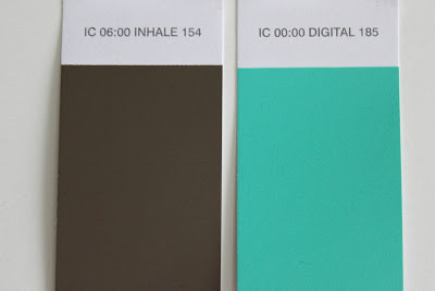
It was painted in Rhythm 167, a deep slate blue, and Rhythm 164, an acidic lime green. In this room, as shown, the slate was the dominant color and the green was the accent. Thankfully the distribution was not reversed. This is not a shy green. 


My first thought when entering this room was that it worked much better with the denim "headboards." (There was definitely a color-coordination issue for me in the first space.) It also felt more sophisticated. The green had a funky, energetic vibe that complemented the deep blue, and seemed to keep it from getting overly moody. 


In this space I felt a little more grown-up than in the turquoise room. It also had more of a hipster-esque quality. Was I cool enough to stay in a space like this? And, unlike the first room, I wasn't instantly taken to a specific place. The turquoise room felt decidedly beach-y. I could assign a locale to those colors. This space, not so much. It definitely had more of a winter-y feel, but if you asked me to describe where it transported me to, I had no answer. 


This space definitely had less energy than the turquoise room, too. Although the green was a highly caffeinated color (like the turquoise), there was less of it so there wasn't as much of an energizing effect on me.

Waking up in the space the next morning, I was still struggling to make an association to the color palette. The colors were nice. They were more masculine than the first room, which could be good for some hotel guests, but it wasn't giving me the same jolt of happy energy. Not that I disliked them or anything, I just didn't know what to do with them.  The colors did create sort of a cave-like effect, which, coincidentally, could be quite welcoming to guests looking for a respite from the hot desert sun.


Ultimately, I think this room made me a little moody. In my journal I wrote "Initially - thought this room looked really cool. Coordinated well with other materials/elements of the room. But, my emotional response was quite different."


And, here's the third room I stayed in.


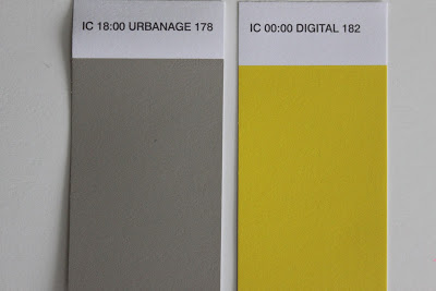
The colors used were Digital 182, a very highly saturated yellow, and Urbanage 178, a mid-tone warm gray. The yellow was the dominant color, the grey the accent.


When I first entered this space, it felt very sunshine-y and happy...and definitely bold! It was very light reflective - much more so than the first two rooms. Although this room was treated with two colors like the others, the gray was so soft in comparison to the yellow that it almost completely receded into the shadowed corners of the white ceiling, giving the impression that this was a one color palette.


Although the yellow coordinated technically with the blue denim headboards, the primary color combination was very childlike to me (and not in a good way.) I did, however, love the touch of yellow on the old wooden school chair - almost seemed like an intentional design decision!

This was the one room where I really noticed a huge shift from day to night. In the natural light the yellow felt very energetic. Although I didn't have a strong personal association to the hue, it no doubt created a sense of super-sunshine. At night, it was a different story. In the artificial light, this highly reflective hue almost burned my eyes. 


While lying in bed before going to sleep I wrote "Making me feel quite uncomfortable. There is a yellow glow to the room which makes me unsettled. Glad this color is behind the bed so I don't have to look at it!" Ouch!

To be fair,  I continued with "There is also pounding in the unit above me. Are there elephants up there?" 

I ended the journal entry with "Wow...the more I sit in here, the stronger my reaction is becoming. And I REALLY don't like it."

It's hard to say what was more agitating to me that evening. Was it the yellow? Or the elephants parading in the room upstairs? Was my negative response to the noise heightened by the color of the room? Or was that poor yellow just a victim of bad circumstance? That's the thing about environments. There are so many factors to take into consideration. Color is just one of those factors. Albeit a very important one. 


There's no doubt that the rooms' hues played a significant role in my experience at The Ace Hotel. I definitely responded to each of the three rooms differently. There is one thing I wish would have been different about this project, however. I felt it was a missed opportunity to not paint the rooms in their entirety. Being completely surrounded by color in a room is quite different than just being exposed to an accent wall or two, which is essentially what we experienced. Would I have experienced the same feelings in rooms painted entirely in these palettes? Would I still have enjoyed the turquoise room, or would it have been "too much" turquoise?  I imagine the spaces would have had a more enclosed feeling, making the cave-like room feel even more cave-like. Great, if that's the effect we are going for.

All in all, this was a really cool experiment to be a part of. I am so curious to know how the experience would change under different circumstances. What if it was a hotter time of year? What if there was no noise in the room above me? What if the rooms were completely painted in the palettes instead of just accent walls? What if the ceilings were painted? What if the entire room decor was coordinated with the paint colors? 

So many questions that I think we need to take another trip to Palm Springs to get some answers. Comex, Arkitip and Ace - Thank you so much for the great opportunity. I hope we can do it again sometime.

A Colorful Trip to the Ace Hotel in Palm Springs - Part II


Last month I took a trip to Palm Springs to participate in a color experiment. I stayed at The Ace Hotel and Swim Club, which I highlighted in my previous post, "A Colorful Trip to the Ace Hotel in Palm Springs, Part 1."  I've been looking forward to sharing the rest of my experience, as it was truly unique. So, here goes!

Backing up a bit, the project was a collaborative effort between The Comex Group, Arkitip and The Ace Hotel. The Comex Group is a major paint and coatings company based out of Mexico. Arkitip, Inc. is both a PR company and art publication in Los Angeles. And The Ace Hotel, is, well, a hotel.

For the experiment, five of the normally all-white hotel rooms were painted in some pretty vibrant hues from the 2012 Comex color palette.

A few of the selected room colors.
The entire 2012 palette,"Inspiring Cultures," is based around "a central theme, outlining the global factors affecting trends and our emerging color and design choices." Within the 2012 palette are four trend stories which represent a different time of day, "going full-circle round a 24 hour day, and in turn completing a life cycle." These trend stories are: 1) 06:00 Inhale, 2) 12:00 Rhythm, 3) 18:00 Urbanage and 4) 00:00 Digital.


Pretty cool concept, actually. And they have illustrated it beautifully in this gorgeous 90 page hardcover book. 


The purpose of the experiment was to have all of the participants experience firsthand the different moods that environmental color creates. As Eddie Harari, head of Color for The Comex Group, wrote in his welcome letter, "The importance of color in our lives is immense, even if we don't notice it. Just think of your favorite sunset, an icy landscape, a jungle, or your favorite Sunday at the beach. Maybe you visit a friend's house who is a fantastic interior decorator, or travel to the Caribbean, India or Latin America where they embrace dramatic color. We hope the colors chosen for your rooms affect you like these experiences have, so that you feel genuinely transported....We hope that this experience will help open your mind and influence you to no longer be timid when choosing the color that surrounds you. Be brave, and bask in your magnificence!"

Amen! I'm all about being brave. (Shameless plug: The Brave New Home.)

Here's a shot of the "regular" rooms at the Ace hotel. I did not stay in one of these rooms during my trip. I'm not sure how I would have felt in this space - probably would have been craving a bit more color? It's hard to say. I think I might have to go back for another Palm Springs vacation experiment to test it out.

source

The first night I stayed in a room painted in Comex' Digital 185 and Inhale 154.


The second night, the room was in Rhythm 164 and Rhythm 167.


And the last night, the colors were Urbanage 178 and Digital 182.


Those are some crazy hues, right? Aren't you dying to see how the regular rooms look with the colorful overhaul?

Here's a little peek, but you'll have to come back to read Part III for the full story on how these rooms looked, how they made me feel and my thoughts on the entire experiment.  There's just too much to say, and I don't want anyone falling asleep before they get to the end of my blog post.


How To Bring Joy Into Your Space


Get a pink chair.

Seriously.

Ok, so maybe it doesn't have to be a pink chair, exactly, but the point is - bring something into your space that is quirky, playful and unexpected.

Let me share my little story about this pink chair and how it's not only reminded me how to decorate, but also how to live.


I've been working on our home lately. Painting, buying stuff, moving furniture around - trying to visualize how all the pieces can fit together. What to keep, what to get rid of, what to re-furbish. And, of course, agonizing over color decisions. We've got some stuff, but not a lot...and it really is a mish-mash. Don't get me wrong - I love a good mish-mash! But it can definitely be a challenge to pull together.

After purchasing a sofa, and painting the living room (with the help of my wonderful friend Rachel at Hue Consulting), I started to get a pretty clear vision of the space. With walls the deep yet translucent green hue of wine bottles, accents of turquoise and rich, velvety red, and dark brown and black wood furniture, I knew I wanted to create a a moody, victorian-esque space. A space with deep, rich colors perfect for dinner parties - and even more perfect for a Halloween-themed dinner party. Moody and dramatic and sophisticated. It was time to be grown up in my space, once and for all. Yes - that's it! A real grown-up space for a real grown-up girl.

Then I found the pink chair.


It was sitting quietly in the corner of the living room at an estate sale, minding its own business, when it caught my eye. Then I heard it calling my name. I mean, really calling me. Especially with its $60 price tag. I sat in it for about five seconds and that was long enough for me to decide that it was seriously one of the most comfortable chairs I've ever sat in. Sold.

With sheer determination (well, and a whole lot of adrenaline from my shopper's high) I hoisted that chair out of the living room by myself, only narrowly missing the Lladros, Hummels and other shoppers, and dragged it to the car. When I ventured out yesterday morning, was I looking for a pink velvet wingback chair? No. Not at all. But on a subconscious level, I must have been. Because it found me.


When I brought the chair home and placed it in the living room I loved it immediately. It looked like a piece of candy. It made me happy. Not just because it was a great find (although that helped), but because of its color and shape and what it did to the room. It made it playful.

But wait - I wasn't going for playful. I was going for grown-up and sophisticated and moody! Well, that chair had different plans for me. And, you know what? It's a smart little chair with really good plans.

You see, that chair makes me smile. And, quite honestly, before I brought it into the space, nothing made me smile. I was trying so hard to create a space that felt a certain way that I forgot about joy. We get so much out of our spaces. They help to make us feel one way or another. The colors, textures, shapes, sizes, and smells, all create an experience. Without something - or many things - that make us smile, it becomes very difficult to experience joy in a space. The pink chair was just what the space  needed - just what I needed.


As I look at the pink chair in the morning light, I am reminded not just to bring more joy into the physical space of home, but to remember to bring more joy into everything, every day. Because, ultimately, it's really up to us to create our own joy.

With a little help from a pink chair, of course.


What brings you joy in your space?

If you need help bringing joy into your home, please call me at 650.867.3896 or shoot me an email at kelly@artestyling.com to discuss your project.