New Office Paint Color


Hey, everyone. I've been busy working on my own place these past few weeks - such a luxury! After nearly six months in our new house it was time to dedicate some serious design thinking to the place I call home. There's still lots to do, but I wanted to share a few pics.

Before...

After

The new color is Pratt and Lambert's New Glarus (21-20.)


I was looking for the perfect shade of "jade" - something that looked like two of my favorite pieces of jewelry - and this was it.


Are any of you working on home projects right now? Please feel free to share photos on my facebook page.

Ok. Now back to organizing. Hope to share more progress soon!

New Office Paint Color

Hey, everyone.

I've been busy working on my own place these past few weeks - such a luxury! After nearly six months in our new house it was time to dedicate some serious design thinking to the place I call home. There's still lots to do, but I wanted to share a quick before and after of one corner of my office. (Just one corner because the rest is a disaster with a capital D!)

Before

After
The new color is Pratt and Lambert's New Glarus (21-20.)


I was looking for the perfect shade of "jade" - something that looked like two of my favorite pieces of jewelry - and this was it.


Are any of you working on home projects right now? Please feel free to share photos on my facebook page.

Ok. Now back to organizing. Hope to share more progress soon!

New Year, New Color Story in Better Homes and Gardens


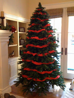
Ok, so this may be old news to those of you on facebook, but...

I'm featured in my third color story in the January 2012 issue of Better Homes and Gardens! I started working with BHG last summer on the concept of red-violets and it's finally here. I just adore these hues. 


BHG included a lot of great info from our interviews in the print edition, but if you want more be sure to check out the digital edition on your iPad. (Print subscribers now have free access.) There's a bathroom inspiration board I designed, as well as an audio clip and additional color tips. 


And in case that's not enough, here's a little more violet insight from the interview just for my blog readers. 

BHG} How can you make lilacs look less girly?

KB} We all have very complex psychological associations with colors -not just violets - that are based on our cultural upbringings, amongst other things. Although there is an inherent sweet and floral association with many of these red-violet hues simply because they are the color of familiar flowers, much of our perception of red-violets is taken from what we’ve learned over time. Violets weren’t always associated with girly-ness. Purple was, and still is, a color of royalty. Red-violets can be very powerful and mystical...it just depends on the exact hue we are referring to. 

"Red-violets aren’t just for girls. The deepest of these hues can be mysterious and powerful."

With that said, color is never viewed in a vacuum. That means that we experience a color with everything else that surrounds it. When we use a paint color on the walls of a room there are always other design elements that come into play and affect how we perceive that hue. To keep a red-violet room from becoming “too girly” it’s important to consider the other colors and textures in the space. Adding lace, dolls, floral fabrics and more red-violets to an already “lilac” room is only going to emphasize the girliness. 

To create a less girly space, it’s important to bring in elements that are inherently less girly. Black and white photography, industrial inspired decor, streamlined furniture designs are just a few ideas on how to tame the romantic quality of red-violets. Also, pairing red-violets with colors that are not perceived as feminine, such as greys, blacks, browns, deep blues, etc, can help combat that girly feel.


BHG} What tricks are there for using lilacs/violets/purples? Does a little go a long way with the richer shades?

KB} The deeper shades of red-violet are actually less feminine and, in my opinion, easier to decorate with. The deeper the hue, the less sweet and romantic they are. The lightest tints of red-violets read as the most delicate and feminine, whereas the deepest shades read as more powerful and masculine. They also read more passionate. I would suggest to anyone painting their walls in these hues who is trying to steer clear of a romantic effect to go deeper in value. 

BHG} How can you make lilacs/violets/purples be more livable?

KB} I think the first thing to do is to eliminate that assumption that they aren’t livable. And the idea that violet/lilac/purple is one hue. There is a huge range of violets, and, like any other hue, different variations create entirely different moods and effects. Next thing, remember that colors do not live in a vacuum. These red-violets can look very different depending upon what colors and textures they are paired with. Think about the overall mood you are going for in a space and then select a violet that supports that mood. Sophisticated and mysterious can be achieved using red-violet just as well as sweet and romantic can. 

"The palest red-violets are like a sweet, fragrant whisper, while the deepest shades are a symphony for the senses."

BHG} What rooms are they best used for?

KB} They can be used in any room. Depends on what mood you are trying to create and what specific red-violet is being used. Also depends on your personal preference, color tolerances and psychological associations. I wouldn’t ban or promote violet for any particular space.

BHG} Is it a trendy color? Classic? Timeless? What tricks are there to giving it longevity?

KB} Any color can have longevity as long as it speaks to you. If you love violet, use it. If you don’t love it and you are using it simple because it’s trendy, it won’t have any longevity. 

A Colorful Trip to The Ace Hotel in Palm Springs - Part I


Last weekend I had the amazing opportunity to visit The Ace Hotel and Swim Club in Palm Springs. I was invited, along with a handful of design and lifestyle journalists and bloggers, to participate in a color experiment sponsored by The Comex Group and Arkitip, Inc. Comex, based out of Mexico City, is the parent company of PPI (Professional Paint, Inc.) which they acquired in 2004. In California, you might recognize their paint brand Frazee. Arkitip, based out of Los Angeles, is limited-edition art publication and also the curator of a "plethora of creative endeavors." For this project, Arkitip worked with their client, Comex, to create a color-focused installation at the Ace Hotel. This was a new experiment for all involved, and I have so much to talk about I think it's best if I break the story into a few parts.


Let's start with the Ace Hotel.


The Ace Hotel Group, brainchild of hotelier and uber-cool guy Alex Calderwood (whom I had the wonderful pleasure of meeting) currently has four locations -  Portland, Seattle, New York and Palm Springs - with plans of expansion underway. Each hotel has its own style and feel, and careful consideration is given to the architectural and cultural history of each place. The Palm Springs location is no exception.


The 180-room hotel itself is "built on the foundation of a 1965 Howard Johnson hotel" while the adjacent restaurant, The King's Highway, is a resurrected Denny's restaurant. If you're lucky, while you're dining you can catch a performance by "Linda Fabulous", the resident show tunes belter/hostess who used to be an understudy for Barbra Streisand on Broadway. And The Amigo Room, with it's delicious artisanal cocktails and cave-like atmosphere, is an old school bar you don't want to miss. Much of the decor was kept in tact or re-purposed, providing the bar with colorfully rich layers of character and history.

The King's Highway set against the mountains.

The entire property is a visual feast. Its location is perfectly framed against the desert mountains, almost creating the sense that you are on your own little island...your own oasis in the desert. So, rather than talking your ears off, or, rather, writing your eyes off, it's probably best if I finish up this post with some photos of the property. And I'll continue my Palm Springs adventure in Part II...

The doors to the hotel lobby. Vespas (in reflection) are for rent.


Could that be Pantone's "Tangerine Tango" on the doors?

One of the exterior fireplaces featuring ceramic art installation by Stan Bitters.


Look closely - there's a beautiful violet-headed hummingbird in there!


"We have been called a boutique hotel. We're not sure what that is. We just love doing things our own way, and creating a neat experience based on a sense of place." 
- Ace Hotel website

Have you been to any of the Ace Hotels? If so, what did you think?  

How to Decorate an Artificial Christmas Tree


This is my clients' home. Every year, for the past seven years, I've been decorating their home for the holidays. The first year I decorated, they purchased an artificial Christmas tree. Although I am partial to real trees for many reasons, there are definitely some advantages when it comes to decorating a tree of the man-made variety. 

Now, there isn't just one way to decorate a tree - artificial or real - but over the years I have learned a few tricks of the trade. 


Photos ©Vanessa Stump


Some of these tricks I picked up while working for Susie Coelho back in my early days of photo styling, as shown above. And many of them I have learned through trial and error. But there's always more  to learn. So feel free to share your favorite tree decorating tricks here and hopefully we can all come away with a few extra styling skills.


1) Get a Pre-lit Tree 
This tree is pre-lit. If you're going to purchase an artificial tree, I highly suggest getting a pre-lit one. It saves a ton of time not having to string the lights.

2) Straighten it Out
Take the time to straighten and manipulate the branches. These trees get crammed into boxes and look anything but natural if you don't help them out a little. But don't straighten the branches too much because real trees have their flaws. You're not trying to achieve perfection, just a more "natural" look. Although this step is kind of a pain, it's actually a decorating benefit to have wired branches that you can twist and turn into whatever direction you need. 

3) Just Add Ribbon
Begin the decorating with thick wired ribbon in a color that will stand out against the dark green branches. The past few years I've used 3" wide red ribbon, but other hues will work great, too. This tree is about 9' high and uses three large rolls of ribbon. It's tricky to get the spacing right, so I first loosely lay the ribbon on the tree branches, as shown in the second photo. You will need to step back and examine the tree at all angles to make sure the ribbon spacing looks right. No steadfast rules here - you'll know if it looks off.

4) Work the Ribbon
After the spacing is tweaked, I begin working the ribbon into the branches of the tree. This is where you will be very happy you have wired ribbon! You want to make it look flowy - not too contrived - but also balanced. This is not an easy task, so give yourself lots of time. And keep stepping away from the tree to see how it's coming. (You will be doing a lot of this. Count it as your workout for the day.)

5) Top it Off
Get that tree topper on. Many of you probably wait until the very end to top the tree, but I like to put the topper on early in the decorating. Maybe because it gives me a sense of accomplishment? It's kind of a milestone when I know I still have a long way to go.


6) Stuff with Branches 
Real or artificial, I love stuffing a tree with branches. This year the branches were artificial, but you can use real greens and berries, too. A favorite trick if you are using an artificial tree and miss the smell of pine, is to plug the tree with real pine branches or eucalyptus leaves. Either will create a beautiful smell in the house - much better than those pine-scented plug-in air fresheners. Here I've started with some artificial berries and red hydrangea flowers from Michael's. 


7) Even Distribution
When introducing the branches, make sure that the different types are distributed evenly. You don't want all your red berries at the bottom, for example. Color and texture in general should always be evenly distributed. Again - lots of stepping back and assessing at all angles.


8) Sparkle, Sparkle
It's always good to add some sparkle. This is a collection that I've created for my clients over the years of gold pinecones, berries and eucalyptus. The pinecones typically come on large sticks which are too long to use at the top of the tree. Snip off a few so you can use them at the narrowest part of the tree without looking like you're trying to play a game of Kerplunk. (Ummm...does anyone remember this game?)


9) Fill in the Holes
Again, distribute each type of branch as evenly as you can. You'll start to eventually see where the "holes" are and it will get easier to place your decorations.


10) Extra Topping
If you want to add a little extra topper, stick a few flowers or ribbon at top of the tree. I used artificial poinsettias because I had them on hand. I could have used hydrangeas, but I didn't have any leftover. Sometimes you gotta use what you have!


11) More Texture and Color
For more depth, texture and sparkle, keep adding different types of branches. I love using the bright green leaves because it gives the tree a very fresh appearance...and those painted sparkly gold sticks are a must-have for any tree, in my opinion. Again, just keep plugging away and stepping back. And when you think you've added enough and there's just no more holes to fill, add a few more. You might need to tear the branches into smaller pieces so you don't get a clumpy look...and also so you can stick a few proportionately sized sprigs at the top.


12) Keepin' it Real
One thing you want to make sure you do is to plug in the branches, flowers and whatever else you are decorating with, at different depths. I usually like to have the gold branches stick out of the tree a few inches, while the flowers I keep more flush to the edges of the tree branches. This creates a more whimsical effect and a more "natural", imperfect feel.


13) Hang the Ornaments
The final decorating step for me is adding the ornaments. I have just used colored ball ornaments here, but obviously you can use other types. Try to stick with the same color scheme you've already established so it doesn't get too hodge-podgy. (If you like hodge-podge, by all means, disregard this suggestion. Sometimes sentiment wins out over coordination.) I prefer to use ribbon hangers as opposed to the traditional wire hangers (thanks in part, I'm sure, to my early exposure to the film Mommie Dearest.) Yes, it's slightly more time consuming, but I like the look. And with the artificial tree, you can  manipulate the wire branches so the ornaments are super secure.


And here's the final tree! (It's an iPhone photo...scroll down for pics with the "real" camera.)


Another styling trick: Use consistent colors, textures and materials from the tree for adjacent areas of the room you are decorating. As shown, I used the same red hydrangeas, green leaves and gold sparkles on the mantle to create a continuity throughout the room.


And here's some final photos from last year's styling. My clients are having a big party this year, so all the furniture is removed from the space. Not ideal for taking after shots. But the tree is still just as lovely.


Last year I plugged in some magnolia flowers - they work great, too. See? No hard rules. There's a million variations for holiday decorating. Maybe even more.


Now, I'd love to hear your decorating tricks. Please share here or on my facebook page. Photos are encouraged!


If you need help styling for the holidays or any day, please call me at 650.867.3896 or shoot me an email at kelly@artestyling.com to discuss your project.

Grandma's Hutch Makeover - Before & After


We've been in our new place for over four months now. You'd never know it by looking at the way it's decorated. I'm starting to get a little grumpy with its overall state of un-decoratedness. And I'm definitely getting past the point of being able to use the excuse "we just moved in." So, I've been making our place a priority the past couple of weeks. The progress is slow, but I do have an amazing project to share.

Hutch Before
This hutch was my grandmother's. Probably from the late 1950s. It sat in my grandparents' house for as long as we can all remember. It's not anything particularly expensive or fancy, but it definitely has good bones. I don't have much from my grandmother, so this piece is very special to me. Although I liked the wood finish, it was a little beat up (mostly from me using it as extra counter space in our previously tiny kitchen) and was begging for some TLC. 

Hutch After Painting
After much deliberation, I opted to paint it black. This is where my dad stepped in with his sprayer.  He also fixed a few broken edges, polished up the hardware and added new casters. Thanks, Dad!

Hutch After Styling
I'm in love with the final product...and now I've got a much-needed boost of energy to keep the decorating process moving. I'm hoping to share more projects in the upcoming months. Gotta keep that creative mojo going.


What furniture pieces have you resurrected? Share your photos by posting a link in the comments section. Thanks!

UPDATE: For those of you who requested more information on the painting process, here you are!
1) The hutch was first sanded to remove the existing finish.
2) Then it was primed. One coat with the sprayer. My dad used an oil-based primer and tinted it with black oil-based paint. (He wasn't sure how much black he added. Just dump some in.)
3) The piece was given a bit more sanding.
4) Then a single coat of Rustoleum oil-based satin black paint. About 10-15% paint thinner should be added to work with your sprayer.

That's it! My dad has a Graco HVLP sprayer with a "3 stage turbine." He thinks he used the "#4 nozzle." His biggest piece of advice - use a good sprayer. His model costs about $500 or $600.

Hope that helps! I sure am lucky to be able to outsource painting jobs like this. If you're handy and crafty, I'm sure you can do it yourself. But you can also hire painters to do the job, too.
Let me know if you have any more questions.


If you need help resurrecting or customizing an old piece of furniture, please call me at 650.867.3896, or shoot me an email at kelly@storyandspace.com to discuss your project.