The Deets on My Apartment Therapy Room For Color Contest Entry

It's time for Apartment Therapy's Room for Color contest again. I entered last year and was one of the finalists in the "Dark" category. (I wish they didn't use that word, "dark". It sounds so scary! I much prefer "deep." Because a space with deep colored walls can have lots of light and therefore not technically be "dark". But I digress...)

Here's a collage of my living room entry from last year, "Kelly's Deep Teal with a Funky Vintage Vibe":

This year I almost didn't enter. Honestly, my "Mystical Atelier" wasn't done done. There are a lot of things that are kind of wacky and unfinished, but I figured what the hell. It was a good kick in the pants to spend a little time cleaning up and styling and taking some decent photos of a space that is how it is. It's a real living space, not a perfect one. At that is a good thing to share.

Before

This room wasn't much to start with. It's a 1950s box with zero detail. The glass in the window is broken, there is a hole in the floor where an outlet used to be, the door doesn't close properly, and it has a silly central vacuuming plug that we have yet to remove from the wall. (I'm sure you can spot it if you look carefully!) The furniture is mostly hodge-podgey leftovers - pieces that didn't fit in the rest of the house - and the area rug (from Overstock) was a quick fix. We needed something for the pup to lie down on so he didn't bang up his bony little elbows. Oh - and it desperately needs window treatments. But, like I said, it is what it is. And hopefully there is some inspiration in that.

After (or rather, "in-progress")

As I wrote in my entry, I was "looking to create a masculine, intellectual, artistic space for reading and playing music. Charcoal gray on the walls was the right color to help lay that character foundation. To keep the space from getting too moody, however, I came back in and painted the bookshelves in a bright red."

The walls are painted in Sherwin Williams Sealskin, a deliciously warm and deep charcoal gray. The bookshelves got leftover front door paint in Sherwin Williams Real Red. (You can see the same color on the front door in the living room pics.)

And just for fun, here's a before of the bookshelves, which we purchased from an estate sale just across the street. Keepin' it in the hood.

As most of you know, I love vintage. The chair was a find at an antique store a number of years ago. It looks pretty, but being a real Victorian piece, it desperately needs to be re-stuffed. Someday.

The mirror is also vintage from an estate sale. I stole it from the living room to fill up the wall space for the photos. But it looks so good there, I'm going to leave it. 

The armoire - which is HUGE - was made by my dad to house our gargantuan TV back in the day before flat screens. This is literally the only room in the house where it fits. It holds a lot of junk, which is good. And not so good.  

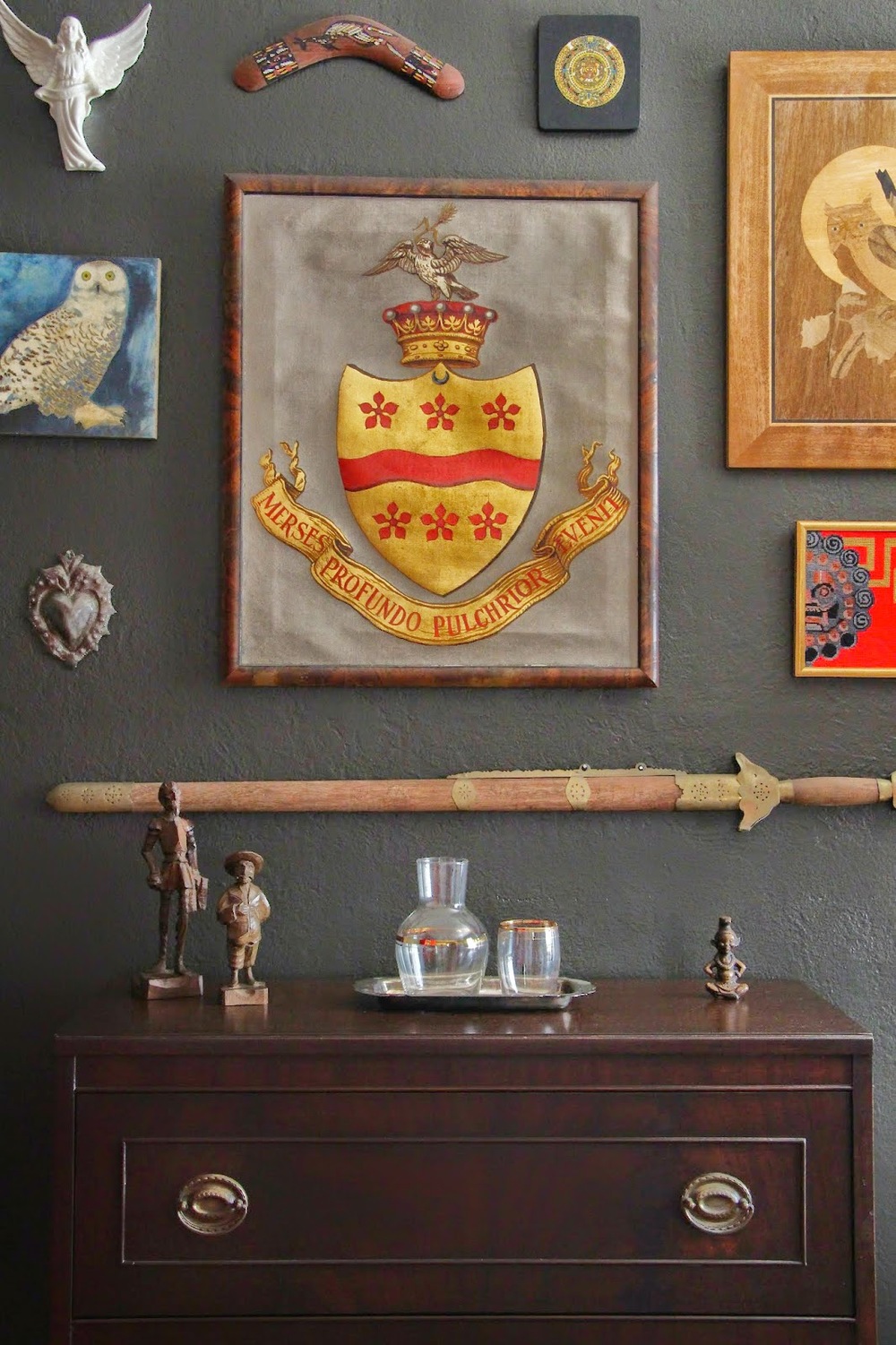
I had fun with this gallery wall. My husband has a strange collection of "anthropological" things, and one day I curated this small gallery for him. Yes, that is an actual coat of arms from his family's lineage. The desk below the display was my grandmother's.

I found the green lamp - which I love! - at a garage sale for $3. And the mid-mod end table? Free on the side of the road.

The fern was another item I stole from a different room. But, again, it looks too good in here to move back. I'll just have to buy another one.

The day bed was a recent purchase from Cost Plus World Market. It's not super fancy, and I hope to replace it with some cool vintage velvet find at some point, but for now it does its job well. And I love how the cream color brings lightness to the space. Oh- and the pillows and throws? Some are from Ross Dress for Less (I am not ashamed!) and some are vintage. 

So, now you know all the dirty little secrets behind this room. Hopefully it endears you so much that you feel an overwhelming urge to head over to Apartment Therapy right this second and give it your vote! Voting ends October 3rd. I'd be much appreciative if you can share the love. I promise to send it right back atcha. 

How to Select Paint Colors for a Mountain Cabin

Here's my brother's cabin in Twain Harte, CA. Twain Harte is a cute little mountain community in the Sierras named after Mark Twain and Bret Harte. It's a three hour or so drive east of San Francisco and has a population of about 2,500 people. My brother and his partner purchased the property about two years ago and have been steadily working on the project, making it their perfect mountain getaway.

 
fullsizeoutput_6c4.jpeg
 

Although there was originally an old cabin on the property, they unfortunately had to tear it down and re-build. It was too decrepit to salvage. However, they paid homage to the original cabin design with their new construction, and did at least manage to keep the back house (which will eventually be transformed into an in-law unit) as well as some knotty pine that will be repurposed for interior wainscotting.

Naturally, when the time came to select colors for the house, I was bribed into helping. (My brother's a trained chef, so he can always successfully bribe me with a good home-cooked meal.) I had never consulted on a mountain cabin before, but was up for the challenge.

So how, exactly, do you go about selecting exterior colors for a mountain cabin? And how do you do it remotely (since there wasn't time to get to Twain Harte before the painters started painting. Doesn't that sound familiar?)

You start by asking lots of questions.

I verbally guided both of them through a polarity profile, which is basically just a way of measuring and assigning meaning to a structure or space. Did they want their cabin retreat to feel Happy or Sad? Friendly or Aloof? Open or Private? Formal or Informal? Vintage or Modern? Masculine or Feminine?

Then I had them each write up a list of characteristics that they wanted the cabin to have. They were not to discuss with each other - I was very strict about that. Fortunately, I had their complete cooperation and we ended up with two lists that were VERY similar. They wanted private, vintage-y but not kitschy, masculine, and "mountain-y."

The purpose of doing a list of desired characteristics is to help eliminate certain colors. Once you know that a color or color combination needs to be masculine as opposed to feminine, you can wipe out a ton of options. You probably aren't going for pinks and pastel anything. And private, in this instance, meant that we didn't want to draw a ton of attention to the structure. We wanted to have the cabin settle in to the deep browns and greens of the trees and earth.

The vintage-y part was a little trickier. Vintage can mean different things to different people. This is where I dumped a ton of 8x8 paper paint samples on the table and asked them what they liked. (I've learned that this process doesn't work with most clients. It's just too overwhelming. Since we've worked together on colors before, and it was family...AND it was a free consultation...I knew this approach wouldn't send them running for the door.) As we poured over the paper color samples, we determined that vintage-y meant a reference to their collection of American Arts and Crafts pottery - simplified, well-made, deep, rich and bold with a subtle flair.

After determining that a deep color was the way to go, we just had to figure out which deep color...and what would the trim be? As we pulled color samples, we took each of them outside in the sunlight. It wasn't the exact lighting we would have up at Twain Harte, but at least we were dealing with a single light source, the sun, which is much more predictable than interior lighting conditions.

We pretty quickly eliminated the green color family because there was already a preponderance of green with the surrounding trees. Not to mention, the neighbor's house across the street was green and we wanted a little more originality. After exploring violets and reds and browns, we eventually made our way to deep and somewhat muted blues, which resonated well with my "clients", supported their desired characteristics for the structure, and ultimately, their own personalities.

We finally settled on French Beret, a deep blue-grey by Benjamin Moore for the body of the house. And for the trim we went with a more traditional cabin color in the red family, Hot Apple Spice.

And just because we wanted to make things more difficult, we opted for a third color on the underside of the roof. Well, it wasn't really to make things more difficult. It just didn't feel right to use either the red or deep blue-grey. We wanted to lighten the visual weight the color that would be overhead when you're sitting on the porch. But, it did turn into an opportunity to make the exterior color scheme more complex and, I think, interesting. Unfortunately, I don't have notes on the exact color, but it's essentially a medium muted green/brown.

Here are a few more pics:

fullsizeoutput_76.jpeg
fullsizeoutput_234e.jpeg
IMG_9115.JPG
fullsizeoutput_793.jpeg

Color Consultant? Color Expert? Color Psychologist? Who Does What in the World of Color Professionals

There are a lot of terms out there for people who work with color. So many that it can easily make your head spin. I thought it was time to go over the titles that color professionals give themselves and explain what these titles mean, how they differ and how to know what you're getting - or should be getting - when you hire us for a job.

Color Consultant

A Color Consultant will consult on a project working with paint and other materials for a home or business. Most often the projects are architectural, but color consulting can also cross into product design, graphic design, branding and even fashion design/consulting. An individual who calls themselves a Color Consultant working on architectural projects should have color training beyond a single course in color theory, and should, at the very least, understand paint and the effects of lighting on color perception. But this is not always the case. Anyone can call themselves a Color Consultant.

There are various color training programs available in the U.S. One such program is taught through the International Association of Color Consultants, North America. This organization trains its members in applied color psychology and human response to color. The goal of the IACC-NA is "to use color in a more effective way and create more human, user-supported environments through the educated application of color." (For me, the IACC-NA has provided a wealth of invaluable information and has allowed me to take my color consulting and design services to an entirely new level.)

Architectural Color Consultant

A Color Consultant who specializes in architectural projects. Projects can be commercial or residential; interior or exterior. Rachel Perls of Hue Consulting used to refer to herself as a Color Consultant but found that the title was too vague - she would sometimes be confused as a hair colorist or a wardrobe consultant. "Architectural" clearly implies that the individual works with buildings and that he or she has some sort of professional color and design background.

Additionally, an Architectural Color Consultant can assist with branding and company identity. Sound funny? An office building is a huge representation of a company's image. It's impossible to select colors for a business - interior or exterior - without having an impact on brand identity. And, for brand consistency, a company should consider their logos, website, etc. when approaching colors. It can be tricky to re-interpret company colors architecturally, hence the need for an Architectural Color Consultant. 

Color Designer

This term is used interchangeably with Color Consultant. Color Designer implies that a design education or experience is part of the individual's training, whether interior design, graphic design, textile design, etc.


Color Expert

A Color Expert is essentially a Color Consultant who is trained beyond basic color theory. This person should have significant practical experience with color and some sort of formal color training under their belt. Maybe the training can be substituted with extensive self-study, but this is difficult because of the preponderance of inaccurate color information. A Color Expert should be able to separate color myths from color facts and should also be able to speak about color in various disciplines. There should be a deep understanding of the psychological, biological, and cultural aspects of color and the knowledge should be applied in a practical sense, as well as theoretically.

Color Specialist

Pretty much the same as Color Expert, although this title can be confused with an individual who specializes in hair color.

Color Strategist

A Color Strategist is very similar to a Color Expert, if not the same. Approaching color from an holistic angle, this individual is most likely trained in many different color disciplines, and uses the combined skills of a designer and a planner to reach a very specific set of goals on each project.
 

Color Psychologist

In the U.S and Canada, it is unlawful to use the term "Psychologist" as part of a professional title unless you are licensed in psychology, or are working in certain sectors of the government or academia. Therefore, you probably won't see this title too often. And if you do, you might want to do a little research to check out the individual's credentials. (If any of you know about a licensed Color Psychologist, please share!)

Just because there is a rarity of Color Psychologists doesn't mean that there aren't any individuals who are trained in color psychology. There certainly are. Again, members of the IACC-NA, for example, are trained in applied color psychology. And some design schools offer courses in color psychology as part of their curriculum. But much of this color psychology education is questionable, and, oftentimes, it is this "education" that is responsible for perpetuating color myths. 

Currently, there is not a division of the American Psychological Association devoted strictly to color psychology, although there is a division for Environmental Psychology. Hopefully, in the future, color psychology will be given its own division and own set of standards and will be taken more seriously within our education system.

Color Forecaster

A color professional who focuses on color trends, mostly for marketing and branding purposes. Typically a Color Forecaster works with companies and marketing/advertising agencies on product development and branding.

Color Scientist

Someone who (most likely) has an advanced degree in Color Science and has studied color in the following disciplines: physics, chemistry, physiology, computer science, psychology and statistics. Color Science is defined by Rochester Institute of Technology's Munsell Color Science Laboratory as "the quantification of our perception of color."  Currently, RIT is the only graduate school in the U.S. devoted to the science of color. 

Colorist

An individual who works on color in motion pictures, commercials, etc. (This is fascinating, really, but too complex for me to get into. Anyone who is interested in everything a colorist is responsible for should check out this website, Final Color.) A colorist can also be an individual who adds color to comic books after the black and whites have been drawn. 

Interior Designer

There is a general belief that an Interior Designer and a Color Consultant have the same skill-set and experience when it comes to color. This is not necessarily the case. As a design professional who has been through a Bachelor program in Interior Design, I can confidently say that my education in Interior Design did not prepare me properly to be a Color Consultant...and definitely did not make me a Color Expert. Did I spec colors for projects before I went through the IACC-NA program? Certainly! That has always been part of my job as a designer. But did I do it well? Let's just say there was room for improvement...and there still is. There always will be. That's the thing about color. You'll never have all the answers because color experiences are infinite.

With that said, as long as an Interior Designer is aware of this, I think they can be amazing Color Consultants. A good designer will know that color changes under different lighting, that different clients have different preferences, and that different colors will create different moods. They will be willing to look at each projects' color design independently and objectively and will help their client find the right solutions for particular problems. If an Interior Designer starts spouting color "rules" and claims to have the perfect beige that works in any space - or if their designs are overwhelmingly devoid of color - their color knowledge is probably quite limited and the project might require a Color Consultant with more specialized color training. Interior Designers - it's ok! We're happy to help! There's room for all of us.

Interior Decorator

Essentially the same as an Interior Designer with regards to color training. The main difference could be that an Interior Designer (assuming they've gone through design school, but that's not always the case) has been educated in color theory, whereas an Interior Decorator usually has no formal design or color training.

Whew! I'm exhausted!!! This is all so confusing, isn't it? Does anyone else have anything to add? Did I miss a color professional title? Or, have I unfairly misrepresented anyone? Please add your two-cents! There are so many exceptions to what I've written here, but we've gotta start somewhere. 


A Funny Thing Happened on the Way to the Paint Store

Ok, so it wasn't really on my way to the paint store, it was actually once I got inside the paint store, but that's really beside the point.

Yesterday I went to Gray's Paint, my local paint store that carries Benjamin Moore, to pick up a couple of pints of paint colors to test for a client. (If you haven't heard of the pint-sized samples yet, they are great! Smaller than the traditional quart, but large than those tiny sample pots, which, to me, are just too small to work with. They cost about $6.) As I explored the paint chip section to see what super-hyped up color marketing material has recently been sprung upon us, I couldn't help but overhear the commotion at the paint mixing counter. At first I tried not to listen, but how could I help myself? Some lady was completely frazzled by color.

I kept my distance for awhile, figuring she would wrap things up soon. I could kill a few minutes of time while her perfect colors were mixed, she would pay, leave and then I would go to the counter to get my samples. It's a pretty small store, and I didn't want to overwhelm the guys at the counter - they had their hands full. And, if I hung back, I could hear all the juicy details. (People's color problems to me are just as juicy as the latest celebrity gossip on Perez Hilton. Weird, huh?)

So, about the lady. She was, hmmmm....maybe mid-forties, sandy blonde hair cut into a longish bob (hard to tell, cuz I think she had taken out some of her paint color issues on her locks), glasses, a black shirt, and, well, that's about all I remember. Does this really matter? No. Just thought you'd like to create her character in your head to make the story more interesting.

She had a frantic-ness about her. From my hideout I could hear her say "it's too green...and this one's too orange. I want taupe. Mix me taupe. You know, kind of pink and tan. That's what taupe is, right? A sandy, beachy color?"

The guy behind the paint counter didn't really respond. And I don't blame him. How the heck do you respond to that? She was asking him what taupe is. And telling him to mix it for her. Good luck.

A minute or two later, she ordered "just give me 50% of this one and 50% of this one. I'm bossy aren't I? Well, once we get these colors right you won't have to see me for another 16 years."

I had to stifle my laughter. But, really, I felt sorry for the guys at the counter. They happen to be young guys working in this store - really nice, and get the job done, but, honestly a little too nice with a customer like this. I wondered how many hours she had been at that counter...and how many trips she had made from her home to the paint store and back. And how many painters were waiting for her at home while she struggled to pick the right colors.

Seeing that her transaction wasn't going to be completed anytime soon, I made my way up front. I think one of the guys working was relieved that he could help someone else. I asked him for two pints - one Chestertown Buff, the other, Cork. I tried to give him sympathetic eyes. I hope he didn't think I was hitting on him.

While my paint was being mixed, I found myself practically elbow-to-elbow with the frantic woman. She appeared even more frantic up close, and seemed heartlessly taunted by piles of brochures advertising "The Perfect Color Combinations for Your Home." She had that wild look in her eyes that someone gets when they've stared at paint chips all day. I peered down at her little brush-outs. They were about 2-inch by 2-inch samples, and I wondered what was the point? She appeared to be trying to select colors for her interior - one sample was a medium orange-y brown, the other a greyed-down minty-ish green. She had this teeny-tiny strip of fabric that she was trying to match the green sample to. Seriously - this piece of fabric was about the size of a french fry. There was no way she was going to be able to match a paint color to that! Not to mention the horrible fluorescent lighting overhead. It was a total disaster.

I struggled as I stood at the counter. I wanted to help her. I really did. But, she was not my client, and I'm not one to bombard random people with unsolicited advice. Wait - who am I kidding? I KNEW it was a total disaster, I had no quick and easy solutions to her color problems - didn't even know what the color problems were - and I knew, if I tried to assist her, I might be at that counter for a very, very long time. I had stuff to do.

Paint Guy finished mixing my samples, and while he was ringing me up, I reminded him that I was a designer so could he please give me my discounted cost? As I said the word "designer", I could see out of my peripheral vision the frantic lady's eyes make her way towards me. I smiled at the Paint Guy, and tried to ignore her. We hadn't actually talked yet, and, I figured, now that she knew I was a designer, maybe she would ask me a question? If she asked, I would try to help. Nope - she went right back to her pile of color mess. And somehow seemed even more irritated than before.

As I grabbed my things and started to make my way towards the exit,  I said "Good luck with your colors!" She glanced up at me, still frantic and I think might have said thank you. Then I calmly said, "I am a Color Consultant, if you would like a card."

She got really excited - not in a good way - and, although a lot of words came out of her mouth, the only ones I remembered were "Shoulda, woulda, coulda!" It was such a strange response. I think I then said to her "Well, maybe next time", which is an even stranger response because 1) I didn't give her a card, so she would have had no way to contact me and 2) she had very clearly stated that it would be 16 years before she painted again. I'm not waiting 16 years to help her.

I drove away thinking, what am I supposed to learn from this? How do I help people in this situation? Clearly, this paint selection process was about to send her right over the edge, if she wasn't there already. It doesn't have to be this way. Paint color selection should not be such a horrific thing to go through. I would have loved to give her some advice, but I don't think she was in a place where she wanted to hear it. She obviously just "needed" to get the job done. And any information I would have provided would have probably caused a major short-circuit in her brain. So, I chose to leave the frantic lady alone, hope for the best for her with her project, and blog about it. Maybe somehow, someway, someone will read this post and learn something from this story.

The Fear of Color

I am constantly amazed at people's fear of color. I can't tell you how many times, while selecting paint colors for a client's home, I've heard "that's too bright" or "that's too dark" or "I like it, but I could never use it in my home." I ask them why they think it's too bright or too dark or too whatever, and they rarely elicit a response that makes any sense. "It just is," is the usual reply. As a designer, I want to rip my hair out!

Of course I understand that everyone has color likes and dislikes. We make associations through color. I was just in a seminar with a woman who hated the color "ochre" because it reminded her of the chalk used by a teacher she hated in elementary school. And I personally really dislike forest green. On my fifth birthday, I was forced into wearing a very uncomfortable forest green turtleneck. I’ve never really gotten over that experience.

Color likes and dislikes aside, people still seem to be afraid of using even the colors they love when painting their homes. There is this strange perception that "neutral" colors - meaning tan, beige and off white - are safe. That these colors create a "safe" environment. One where we can separate ourselves from the chaos of the outside world. One where emotions are under control. One where we can feel a sense of calm and not be distracted by something as brazen as color.

I recently paged through a copy of a popular home magazine and ran across this quote from a featured homeowner:

"I like color, but not bold color. Color evokes strong emotions, and I want my house to feel calm."

What is it that we are really afraid of? Why this need to feel "safe"?

Perhaps it is not the colors themselves, but the emotions within ourselves that create the most fear. Color is extremely psychologically powerful, and in using it we need to be comfortable enough with ourselves to accept whatever emotion it may evoke. Obviously, color can be used incorrectly and can create many unpleasant emotional responses. But, think about the most beautiful things you have ever seen. Most likely you will imagine something designed by nature.

A rich red rose.

A shimmering turquoise ocean.

A rainbow.

All of these designs have one thing in common: color. Very seldom will your vision of beauty be something beige. Now think about the emotion you feel from those images. A feeling of amazement? A sense of peace? A burst of excitement? If we can translate those feelings into our homes, why not? A beige wall paint can be fine. It IS safe. It goes with almost everything. But it can also be dull and uninspiring. And to me, a color that is dull and uninspiring is anything but safe. I would rather take a leap and try something new because, really, my biggest fear is not color, or even the emotions they may evoke, but rather the idea of living in a world with no color...and no emotion.