Our New House: One Month Anniversary

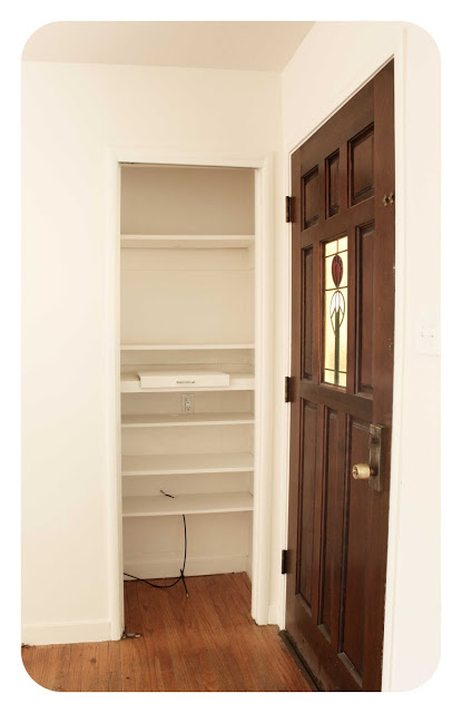
Our new front door

Today is our one month anniversary in our new house. We are still pinching ourselves - is this really ours? Such an odd feeling. A good feeling, but odd and unfamiliar at the same time.  There is also a tremendous sensation of freedom as we have no landlord to answer to. We can pretty much do what we want, when we want. (Unless the city has a problem with it, then it becomes another story.) And with that freedom comes the ability to dream. Before, as renters, we always stopped ourselves from thinking about what could and should be done with our homes because we didn't want to invest too much of our own money into something that wasn't ours. But now, we can open up that creative channel and dream away. It's a fun place to be.

And we will be doing a lot of dreaming because our home definitely needs some updating. Actually, some major overhauling in certain areas. It's a great house and we adore it, but it's obviously been ignored for a long time. To some new homeowners, the condition of this house would be a total drag. To us, it's perfect. 

So, after a month in our new abode, I'm ready to give you a little tour. We haven't done much yet. Just unpacked our boxes (most of them) and moved in our furniture. We really want to live in the space for awhile before we make big changes. And, to be totally honest, we are out of money. So the bigger projects will wait...but that won't keep us from dreaming!

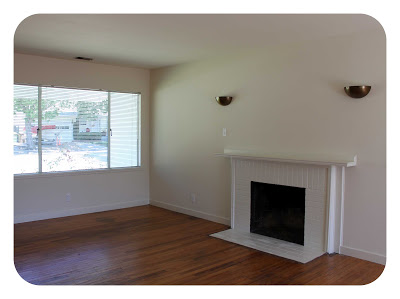
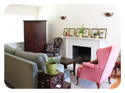
living room before and after


fireplace before and after

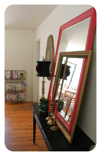
our little entry
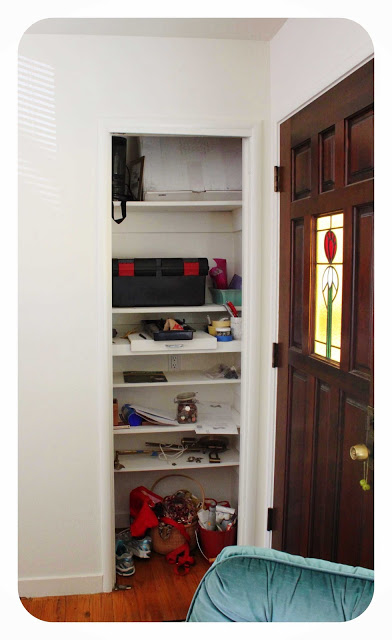
our weird doorless entry closet...that has become a major junk collector - ewww!

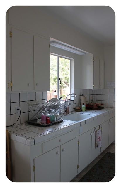
kitchen before and now. not much difference! this is first on our remodeling to-do list.

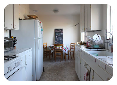
kitchen before and now, again

more kitchen
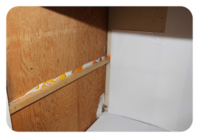
yucky interior cabinets. yes, they smell. even new contact paper doesn't help.
so the food goes in our makeshift pantry
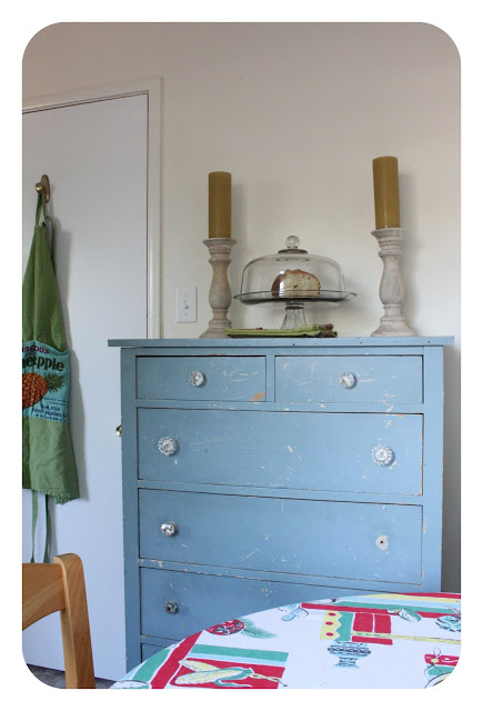
and an extra dresser stores lots of dishes and kitchen gadgets
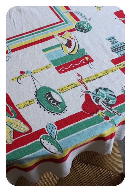
my vintage linens fit right in!
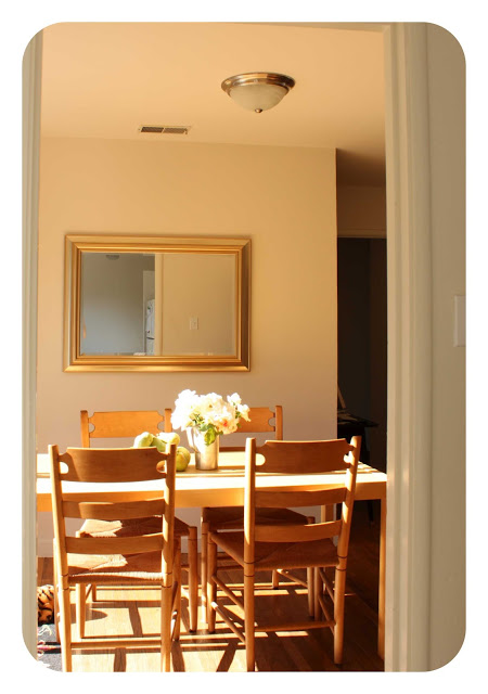
the afternoon sun in the dining area
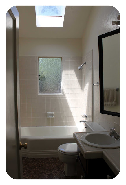
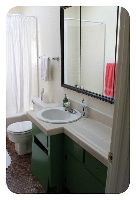
the bath had stinky cabinets, too.
it's in the process of a mini-makeover for now. (more to come later...)
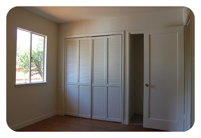
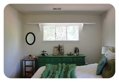
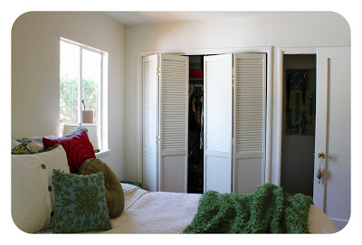
bedroom before and after. what to do with that silly shelf?


bedroom before and after

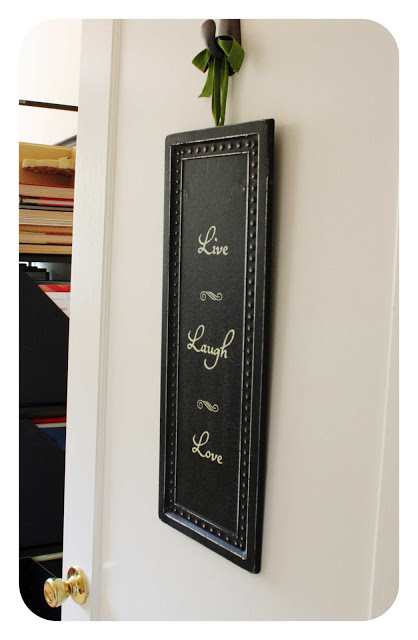
our beautiful half bath that had to be ripped out per the city of San Rafael.
for now it's housing some jewelry
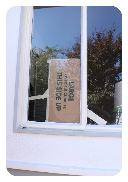
the window I broke on our first day in. yup - those are originals!

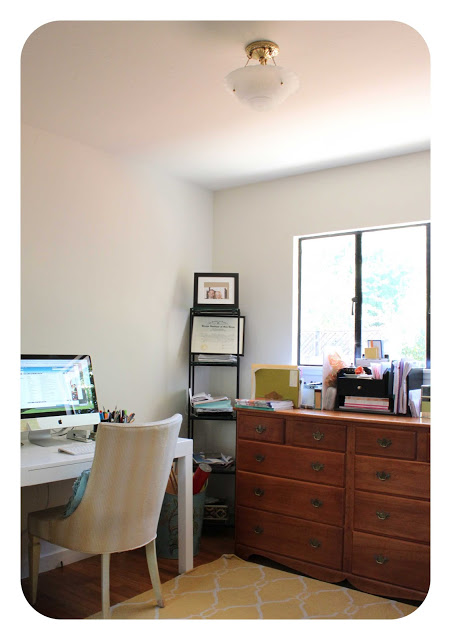
office before and after


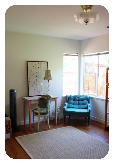
extra bedroom before and after. we're not used to having an extra bedroom. it feels so luxurious!

our front porch. big dreams here.
and our side yard. we're thinking bocce. (so much more yard, but I'm saving for another post.)

As you can see, lots of dreaming to be done. And then lots of doing. As a designer, it's hard not to just jump into everything and try to make it all perfect - especially before putting it all out there for the world to see on my blog! But this is the reality. And making a home takes time and thoughtfulness. Even if we had unlimited funds, we would still wait before making any major changes to the house. I truly believe you have to live in a home a bit before you know what you need from it, and what it needs from you. 

So, I hope you'll join me on this journey! Here's to a little dreaming...

Quoted in Better Homes & Gardens Color Book!


I've been so busy, I forgot to share this amazing news!

I've been quoted in a new Better Homes & Gardens book on color. Not once, not twice, but four times! (Are you kidding? Of course I counted!)

The book is called "Color: The Complete Guide for Your Home." And it's good. Really good. The photos are definitely Pinterest-worthy. In fact, I'm sure many of them have already pinned. (Kate of Centsational Girl wrote a great summary of the book on her blog for BHG.)

My first quote is smack-dab on the "getting started" page. So cool!


Q: How do I know a color is right for my room?

A: Let the idea go that there is one "right" color or you may fail to recognize some very beautiful possibilities for a space. Many colors you think are wrong simply create a different effect.

This is my favorite quote - I can't stress this enough! So glad BHG included it.


So go pick it up if you are looking for some major color inspiration. And - if you still need help, give this designer a ring. I'm for hire.

Better Homes & Gardens and 1950s Barbecuing Culture


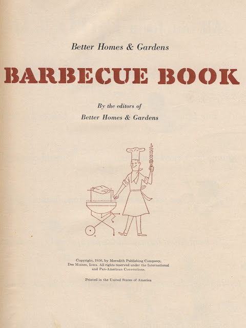
We bought a barbecue grill last weekend. As a joke, I pulled out this vintage cookbook I had picked up at an estate sale awhile back to scope out some recipes. Skewered Ring Bologna, anyone? Maybe with a side of Cottage Cheese Coleslaw and a nice bowl of Chilled Tomato-Cheese Soup? (No, I am not making these up. If you want the recipes, email me.) Needless to say, I didn't not find much culinary inspiration in this book. But I did find a few laughs. And it got me thinking a lot about barbecuing culture.


The cookbook was published is 1956 by Better Homes & Gardens. Not too long after our new house was built. It's kind of fun to think about what this neighborhood was like in the 50s. I imagine there were many backyard barbecues. And probably even a few homeowners owned this very book. 

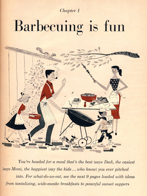
Barbecuing was definitely portrayed as a man's job. And a dad's job. Women could apparently hold skewers of meat though, to pass to their pipe-smoking husbands. (Geez! Enough carcinogens in the air there? Poor little squirrel.)

And it was a more formal affair then it is today. But everything was more formal in the 50s.

Barbecuing wasn't just a means to get a meal cooked, it was meant "For building family memories." And with Dad on the grill, that meant "No kitchen chores for Mom"! (Look at those puffy sleeves! Good thing Mom wasn't "manning" the grill. Those things would've gone up in flames in two seconds flat!)

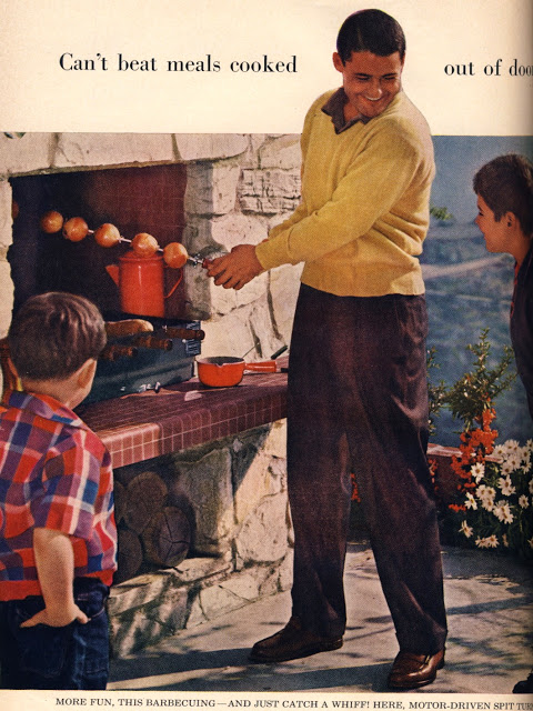
Chapter  2's opener is great. It equates barbecuing to a sport. I guess that's why Mom couldn't participate.

And no way was she cooking the meat because "This is Dad's domain." All she needed to do was sit back and admire her manly husband. 


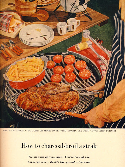
"Tie on your aprons, men! You're the boss of the barbecue when steak's the special attraction."

Wow - talk about pumping up Dad's ego! The boss of the barbecue? That's a lot of pressure, though. Grilling might have been family fun, but it was also some serious business. One cooking mis-step and Dad would have ruined the whole day! Fortunately, the guy in the photo looks like he's got things under control.

So, what do you think? Is barbecuing culture much different today?  Have these 1950s ideals permanently permeated our perceptions of not just how to grill, but who should grill? Have we happily accepted barbecuing as a man's job? And, if so, is it a sexist perception? Or just a way to fairly divvy up cooking duties between the sexes?

Let's hear your thoughts!

Our New House


Wow, wow, wow - it's been a busy, exciting time! I've got so much to blog about. But let's start with...our new house!

We finally bought our own place. After 20 years of renting, this is a major milestone. And we couldn't be happier. We closed last Friday on August 10, our 11 year anniversary. Talk about an anniversary present! There's lots to do as it's an older home, and I have all intentions of sharing everything right here on this blog.

But for now, it's back to unpacking and getting situated and just taking it all in.

Happy Friday!

Featured in Decorating Shortcuts!


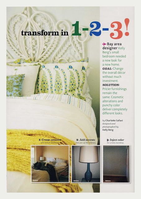
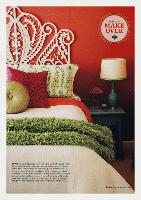
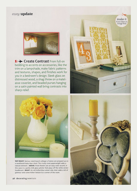
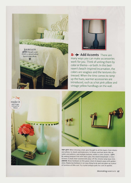
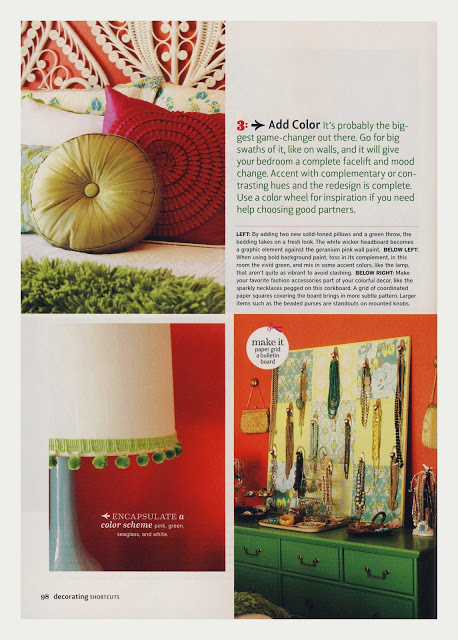
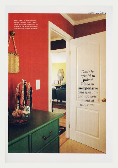
I am so excited to be featured in the current issue of Decorating Shortcuts

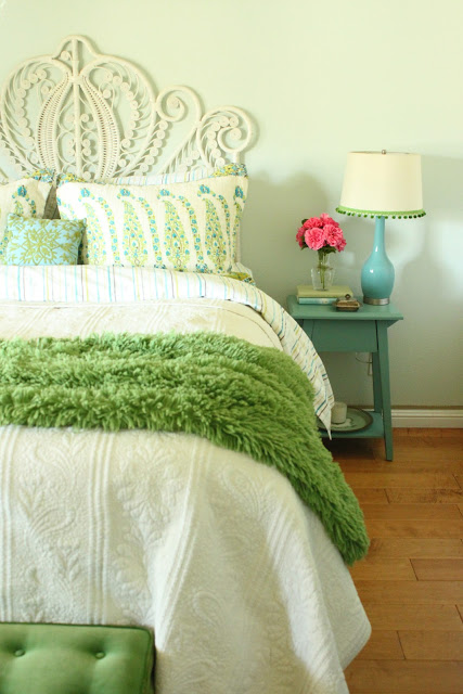
How did this come about, you ask? Well, several months ago the editors contacted me about this photo that they found on my houzz.com profile:

Amazingly, it has been added to almost 10,000 ideabooks. I'm completely baffled by this!

Since this photo was from our old house, and had been reincarnated already, I suggested that they consider using photos from my new design, as well. I had taken all sorts of befores and afters over the past few years, so they were well stocked with images. They were totally into the idea, and moved forward with the story. I couldn't be more pleased with the final product. It turned out great! (Ironically, the image that first sparked the story wasn't including in the final layout. So goes the world of publishing...)

There's some other good stuff in the mag, too, so make sure you pick up a copy. It'll be on newstands through October 2012.


If you want to turn your home into a photo-worthy project, give me a call at 650.867.3896 or shoot me an email at kelly@artestyling.com.

Bathroom Design Project in Walnut Creek


I finally got around to shooting a bathroom design project I worked on nearly three years ago! As I'm working on my new website, I'm pushing myself to get my portfolio updated. Fellow designers, artists and photographers - you all know how difficult this can be! Fortunately, my clients have been very accommodating. I've still got lots more to shoot, but I'm getting there. 

In the meantime, here are my favorites from this Walnut Creek bath project. There are no before shots because it was new construction.  I do have a couple of design drawings to share though. And, yes, they are hand-drafted and rendered. They aren't going to win any awards, but they were instrumental in the design process. 


Here's a very basic floor plan of the space showing the tile design and bath layout, which was already determined when I came on board.


And an elevation of the vanity. I worked on vanity design, mirror size and placement, lighting size and placement and tile design, as well as colors and materials.

Here's an elevation of the two full walls around the bathtub. It's extremely helpful with tile design to sketch everything out, even if your drawing skills aren't awesome. There's really no better way to help visualize how tile will look when installed. 


And if you can render, it's even better! (Rendering is just designer speak for coloring in a drawing.) As you can see, the colors aren't an exact match to the tiles that were installed, but you do at least get some sort of an idea of how the end result will look in color. I could have spent many more hours on this, but I did it quickly and roughly due to time and budget constraints. 


And here's the shower wall elevations. You may notice that the niche design was altered a little from the drawing. The change was made once the installation was underway, and I think it was a good call on the tile installer's part. 


And here's the rest of the final design photos. 


If you need assistance with a bathroom remodel or addition, please give me a call at 650.867.3896 or shoot me an email at kelly@artestyling.com to discuss your project.