Grandma's Hutch Makeover - Before & After


We've been in our new place for over four months now. You'd never know it by looking at the way it's decorated. I'm starting to get a little grumpy with its overall state of un-decoratedness. And I'm definitely getting past the point of being able to use the excuse "we just moved in." So, I've been making our place a priority the past couple of weeks. The progress is slow, but I do have an amazing project to share.
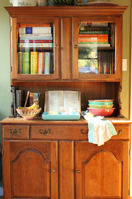
Hutch Before
This hutch was my grandmother's. Probably from the late 1950s. It sat in my grandparents' house for as long as we can all remember. It's not anything particularly expensive or fancy, but it definitely has good bones. I don't have much from my grandmother, so this piece is very special to me. Although I liked the wood finish, it was a little beat up (mostly from me using it as extra counter space in our previously tiny kitchen) and was begging for some TLC. 

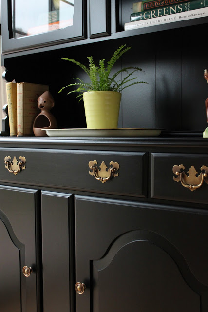
Hutch After Painting
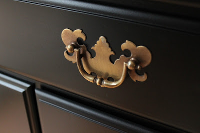
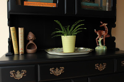
After much deliberation, I opted to paint it black. This is where my dad stepped in with his sprayer.  He also fixed a few broken edges, polished up the hardware and added new casters. Thanks, Dad!

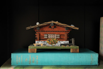
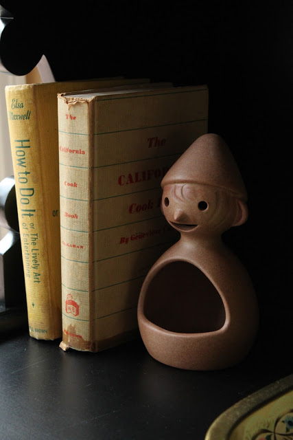
Hutch After Styling
I'm in love with the final product...and now I've got a much-needed boost of energy to keep the decorating process moving. I'm hoping to share more projects in the upcoming months. Gotta keep that creative mojo going.


What furniture pieces have you resurrected? Share your photos by posting a link in the comments section. Thanks!

UPDATE: For those of you who requested more information on the painting process, here you are!
1) The hutch was first sanded to remove the existing finish.
2) Then it was primed. One coat with the sprayer. My dad used an oil-based primer and tinted it with black oil-based paint. (He wasn't sure how much black he added. Just dump some in.)
3) The piece was given a bit more sanding.
4) Then a single coat of Rustoleum oil-based satin black paint. About 10-15% paint thinner should be added to work with your sprayer.

That's it! My dad has a Graco HVLP sprayer with a "3 stage turbine." He thinks he used the "#4 nozzle." His biggest piece of advice - use a good sprayer. His model costs about $500 or $600.

Hope that helps! I sure am lucky to be able to outsource painting jobs like this. If you're handy and crafty, I'm sure you can do it yourself. But you can also hire painters to do the job, too.
Let me know if you have any more questions.


If you need help resurrecting or customizing an old piece of furniture, please call me at 650.867.3896, or shoot me an email at kelly@storyandspace.com to discuss your project.

Interview with Emily Mughannam of Lucite + Lavender


Emily (a fellow Design Institute of San Diego grad) at Lucite + Lavender was kind enough to interview me for her blog.  From favorite gadgets to childhood memories to guilty pleasures on TV, Emily asked me some pretty unique and fun questions. Head on over to learn a little more about me, and to hopefully get a good laugh from a couple of my stories. And while you're there, make sure you check out her other posts, as she's got some great design advice and projects to share. 


Thanks, Emily! (Isn't she adorable?)

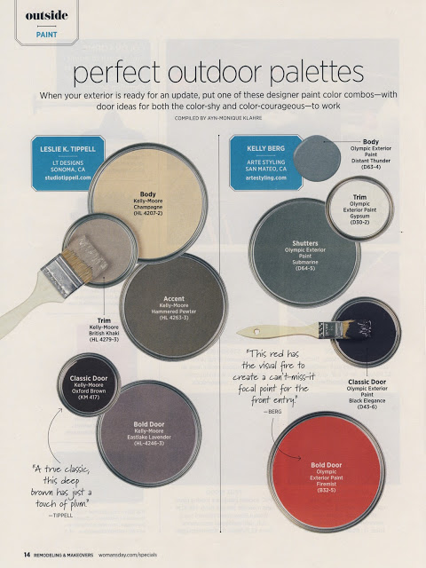
Woman's Day Color Story - Perfect Outdoor Palettes


So excited to announce that I'm featured in this fall's Woman's Day Special Publication, "Remodeling & Makeovers." Page 14. On news stands until Dec 26. I found my copy at Barnes & Noble. (Ok, so I bought several copies as opposed to just one. But I left some for you. It's big news around here to get a spot in the tenth most popular magazine in the US!)


Don't you just love that red? Yum. (I'm trying to figure out how to incorporate that hue into my own place...) 

If you are interested in color and interior design services, please call me at 650.867.3896, or shoot me an email at kelly@storyandspace.com to discuss your project.
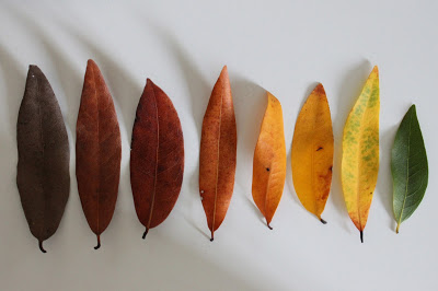
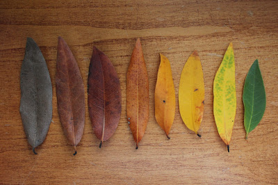
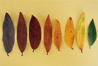
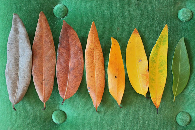
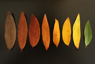
Fall Leaves - A Color Evolution


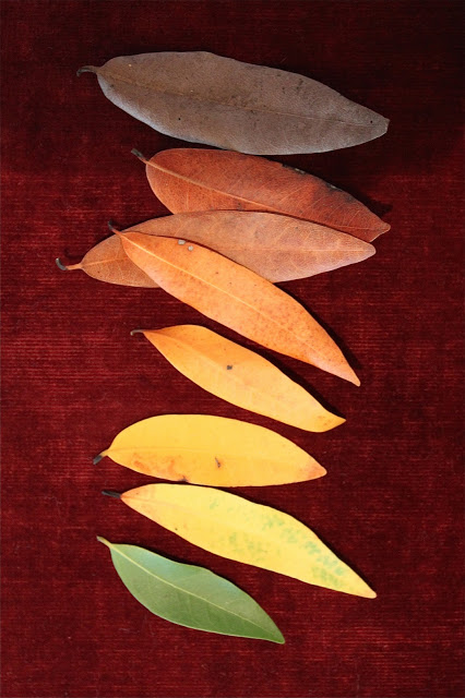
I picked up these leaves on a hike the other day. It started with the brightest yellow leaf which caught my eye among all the brown dirt and dried up crunchy ground coverings. As I looked more closely, I noticed leaves in a rainbow of shades. It took about 10 minutes of searching to create almost a full spectrum. I believe they are all from the same type of tree. (If someone knows what type of tree, please share!) 


What fascinates me most is that the life cycle of the tree leaves follows the order of spectral hues: Green to yellow-green to yellow to yellow-orange to red-orange to near-red to violet-y brown. So easy to take for granted, but think about it for a minute. The leaf colors could just as well be mixed up. Red orange could directly follow the green...and yellow-orange could be the most dead leaf of all. Instead, nature follows this beautiful color logic that feels so perfect we don't even notice how perfect it is.

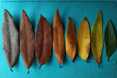
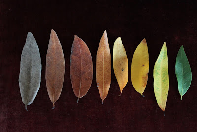
When I brought the leaves home, they just beckoned to be photographed. In exploring different background textures and colors, I created a little study in simultaneous contrast. Basically, this means that colors change appearance depending on what colors they are next to. (This is where I am so happy to have my photo styling experience. You learn to use ANYTHING to create the right look for a shot.)

background: vintage cloth-covered cookbook in turquoise 

background: vintage red velvet chair seat

background: white office desktop

background: wood dresser

background: yellow painted tea cart

background: vintage green velvet bench

background: black painted console table

Do you have a favorite?


photos © Kelly Berg 2011

October Skies


Wow. Can't believe it's Friday already. How did that happen? And we are more than halfway through October.

We've had some crazy weather here in the bay area this month. The first week of October brought some hail and much cooler temps, but we've also been speckled with some very hot days. This weekend is supposed to get into the high 80s again. Can you say schizophrenic?


There have also been some amazing sites in our October skies. We just had a full moon. Did any of you catch it? So bright and magical. And Jupiter is fully visible this month...it is just beautiful. You don't have to stay up too late or get up too early to see it. Apparently you can even view its four moons with even the most basic telescope. And if you decide to stay up late (or get up early) you can also see Mars...and Mercury, Venus and Saturn will make a stronger appearance in November. (Check out Earth Sky for more info.)

Along with all this fantastic solar activity we have been blessed with some amazing sunsets. The colors have been glorious. Here's a few pics I snapped the other night. I am always fascinated by how quickly the colors change, and just how vibrant they are. These sunsets are a testament that, contrary to much of what we hear, "earth" and "sky" colors are anything but "soft and soothing." Just look at that fiery pink in the last shot.


Chronology of a Sunset
Photos © Kelly Berg, 2011
Have you seen any amazing skies lately? If so, please feel free to share photos on my facebook page. We'd love to see them!

Happy Friday.

Introducing The Colorscope - A Brand New Way to Plan Color Schemes for Your Home


Ok, so I'm not really introducing anything new here. This is an advertisement from a 1950s vintage booklet on decorating. The Colorscope was "arranged" by interior designer Vera Adams and offered homeowners "a preview of how your room will look if you combine certain colors." 


"You begin with your carpet color and watch your room come to life. If you are considering the purchase of a new rug, the Colorscope will help you decide, for the 12 leading carpet colors are shown with complete rooms planned around them.
Every color scheme is described in detail and you learn why each color is suggested for walls, draperies, upholstery and accessories.
One of the most important features about Colorscope is that not just one manufacturer's color range is shown. Instead, every leading producer of home furnishings items is represented. You can choose from many colors."

And all this for only a buck! Man, times have changed.

I find it fascinating that the idea to create a systemized, monetized approach to color design is not new. It seems the advertising age of the 1950s spawned this idea that color systems can - and should - be packaged and sold. (Advertising legend Louis Cheskin even tried his hand at a color system for the home.) The funny thing is, none of these systems ever seem to stick. They get their moment in the sun, but eventually fizzle out. That's because our relationship with color is far too complex to be whittled down to a "pocket-sized shopping guide."

The Colorscope may seem silly and dated now, but the packaging and selling of color tools for profit is certainly not a thing of the past. There's a lot of money to be made in color. It's big business. Color is part of everything we purchase. As long as we keep shopping, there are going to be tools to "help" us shop.

Are there any current color tools out there that make you go "hmmmmmm?"